The CSS to display featured page widgets and featured posts in grid columns is different.

This CSS enables you to display 4 featured page widgets, added to 1 widget area, in a grid.
.grid-container {
    margin: 50px;
    display: grid;
    grid-template-columns: 1fr 1fr 1fr 1fr;
    grid-template-rows: auto;
    grid-gap: 20px;
}
Assumes the PHP code for your widget outputs a div named grid-container, otherwise change the .grid-container class in the above CSS rule.
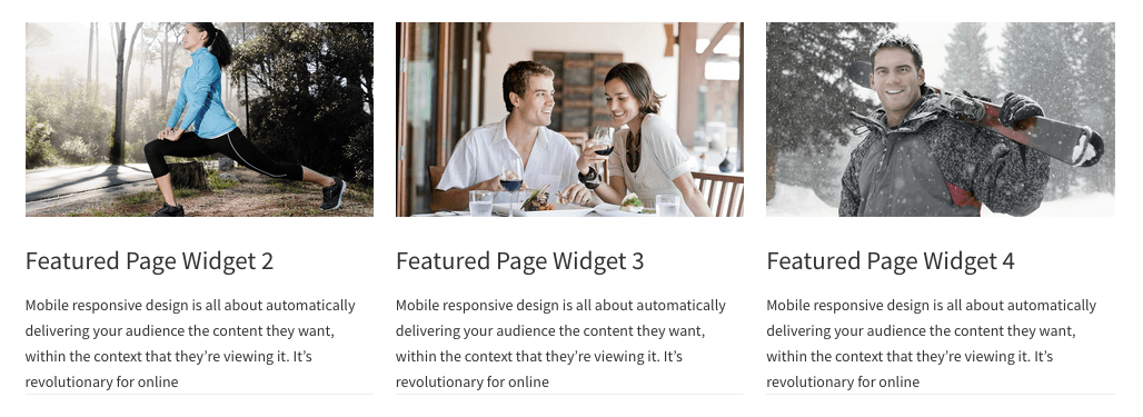
Here’s the result tested using the new Genesis Sample child theme by StudioPress :

You can then add optional CSS for styling and media Queries.
Style Genesis Featured Page Widgets #
Exact CSS used in the above screenshot.
/* Genesis Featured Page Widget
--------------------------------------------- */

.grid-container .featured-content .entry {
	border-bottom: 1px solid #eee;
	margin-bottom: 20px;
}

.grid-container .featured-content .entry-image {
	height: 100%;
	width: 100%;
}

.grid-container .featured-content .entry-title {
	font-size: 23px;
	font-size: 2.3rem;
	margin-bottom: 15px;
	margin-top: 10px;
}

.grid-container .featuredpage .entry-content p {
    font-size: 14px;
}

@media only screen and (max-width: 1023px) {

   .grid-container {
        margin: 50px;
        display: grid;
        grid-template-columns: 1fr;
        grid-template-rows: auto;
        grid-gap: 20px;
    }

}
Grid Template Columns #
Modify the value for the grid-template-columns property so you can change the number of widgets displayed in the grid.
grid-template-columns: repeat(auto-fit, minmax(15ch, 1fr));This enables you to add any number of Genesis Featured Page widgets to 1 widget area and display them in a grid without having to modify the CSS again.
In this case we remove 1 widget and leave 3 which gives us this result without any further CSS modification :
Fallback CSS #
See this example of how to include fallback CSS for browsers which don’t support CSS Grid.
Leave a Reply