
This tutorial contains the code which enables you to add any number of header of any width or height to display perfectly at any screen width. You can use CSS to change the header image at specific screen widths however this solution is better.
Here’s the demo video:
Demo Video #
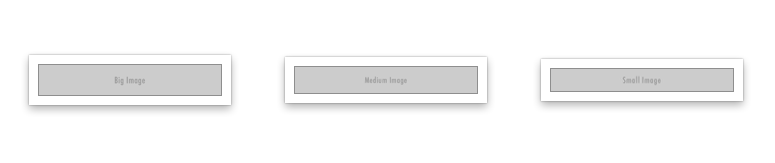
This video shows how you can use different sized images which display at different screen widths in any Genesis child theme. Tested using the Lifestyle Pro child theme by StudioPress.
All you need to do is copy & paste the code in your child theme then add your images:
Works in most Genesis child themes.
Code Installation – From Download Folder #
Here’s the code and simple 2 step installation instructions fully supported for logged in members :
Related Tutorials
- Different Sized Header Image On Mobiles Using Infinity Pro
- Outreach Pro – Different Logo For Desktop and Mobile
- Add Custom Mobile Image After Header At Any Screen Width
- Change Logo On Mobiles When Genesis Responsive Menu Toggled
- Display Different Sized Header Images On Different Mobile Devices
- Change Custom Header Image For Mobiles In Gallery Pro
Was this helpful?
Thanks for your feedback!
Leave a Reply
You must be logged in to post a comment.