
This solution resizes the site header as the screen width reduces. In some themes like Foodie Pro, the header image is coded to using background-size: contain; ( Demo ) so the image isn’t cutoff when the screen width decreases to less than the width of the header image.
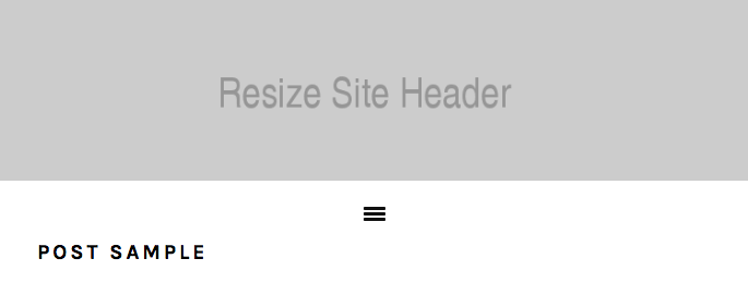
The only problem is the height of the site header is set so as the image decreases, the gap increases like you see in the following screenshot taken at a width of 700px:

On mobile phones, thats a significant chunk of the screen which is white space.
The solution in this tutorial, removes the gap so you get this :
Tested using the Foodie Pro child theme.
Here’s the demo video showing how your header looks at different screen widths. In this case the padding and margins are only removed after the screen width hits 750px width.
#Demo Video
Shows the header image and site header resizing so there’s no gaps.
Register or login to access the full solution :
Leave a Reply
You must be logged in to post a comment.