
The solution in this download folder enables you to display the primary menu to the left, the header image in the middle and the secondary menu to the right, all inline and centered vertically and horizontally using CSS Grid.
On smaller screens, the menu items change from inline to block like this :

And like this on mobiles :
You can see how this works in the following demo video.
Demo Video
Shows the menu logo menu displaying on desktops using the Parallax Pro child theme by StudioPress.
Installation Steps
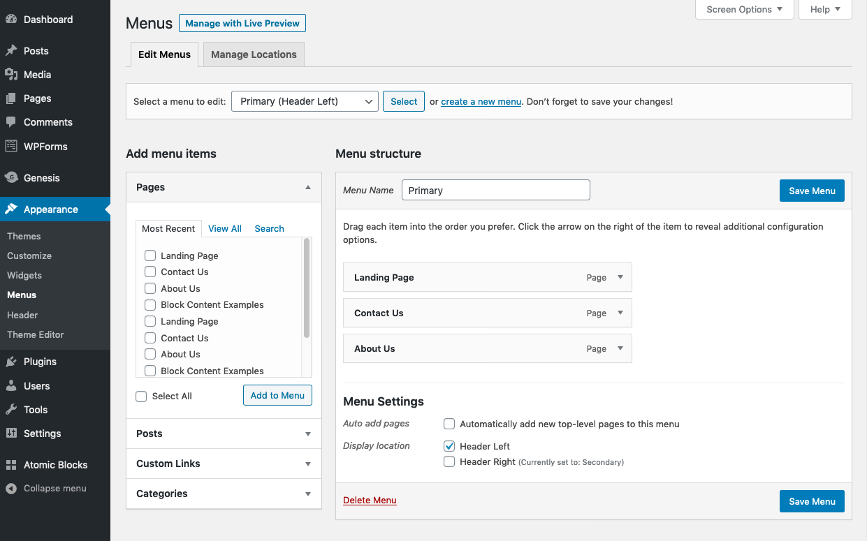
There’s 4 steps :
# Step 3 – Copy & paste the CSS from the style.css file to the end of the Parallax Pro themes style sheet and clear caching.
# Step 4 – Create 2 menus named Primary and Secondary and assign them to the header left and header right locations like this :
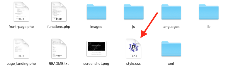
Note : In the download folder you will find a copy of the functions.php file with the PHP modified as instructed in steps 1 and 2.
Was This Tutorial Helpful?