
Both these code snippets enable you to create mobile responsive uneven columns.
- The 1st example produces a 66% width column on the left and 33% width column on the right.
- The 2nd example produces a 60% width column on the left and 2 20% width columns on the right
Update : You can also use the new CSS Grid properties to create uneven columns for widgets & reorder the stacking order on mobile devices & smaller screens.
You can change the widths to any percentage or pixel value.
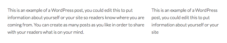
Here’s the 1st result which produces 2 uneven columns.
And the 2nd result which produces 3 uneven columns:

There’s 2 simple steps involved:
- Add the HTML to your editor. text widget or action hook.
- Add the CSS to your child themes style sheet.
Here’s the code:
2 Uneven Columns
HTML
<div class="first-column">
This is an example of a WordPress post, you could edit this to put information about yourself or your site so readers know where you are coming from. You can create as many posts as you like in order to share with your readers what is on your mind.
</div>

<div class="second-column">
This is an example of a WordPress post, you could edit this to put information about yourself or your site
</div>
CSS
The Media Queries in the following CSS display each column 100% when the screen width is 800px or smaller. Adjust the 800px in the CSS to suit your own requirements.
.first-column {
    width: 66%;
    padding: 0 10px 0 0;
    float: left;
}

.second-column {
    width: 33%;
    padding: 0 10px 0 0;
    float: right;
}

@media only screen and (max-width: 800px) {

   .first-column {
        width: 100%;
        padding-bottom: 10px;
        float: none;
    }

    .second-column {
        width: 100%;
        padding-bottom: 10px;
        float: none;
    }

}
3 Uneven Columns
HTML
<div class="first-third">
This is an example of a WordPress post, you could edit this to put information about yourself or your site so readers know where you are coming from. You can create as many posts as you like in order to share with your readers what is on your mind.
</div>

<div class="second-third">
This is an example of a WordPress post, you could edit this to put
</div>

<div class="third-third">
This is an example of a WordPress post, you could edit this to put
</div>
CSS
.first-third {
    width: 60%;
    padding: 0 10px 0 0;
    float: left;
}

.second-third {
    width: 20%;
    padding: 0 10px 0 0;
    float: left;
}

.third-third {
    width: 20%;
    padding: 0 10px 0 0;
    float: right;
}

@media only screen and (max-width: 960px) {

    .first-third {
        width: 100%;
        padding-bottom: 10px;
        float: none;
    }

    .second-third {
        width: 100%;
        padding-bottom: 10px;
        float: none;
    }

    .third-third {
        width: 100%;
        padding-bottom: 10px;
        float: none;
    }

}
Note: You may need to use the clear property depending on how you use the columns to avoid elements after a floating element from flowing around it.
Leave a Reply
You must be logged in to post a comment.