
In this post, i’ll give you all the code you need to create widgets which display your content in-line.
There’s at least 2 ways to do this and i’ll provide the best 2 solutions for you to choose from.
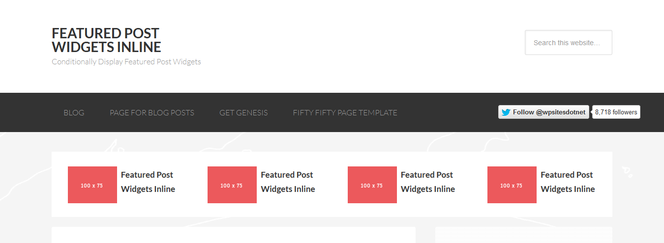
Here’s an example of what can be done.
Update : You can now use CSS Grid to display any number and any type of widget inline. Here’s the CSS which assumes your PHP code which generates the widget includes the class, grid-container.
.grid-container .widget-wrap {
    display: grid;
    grid-template-columns: repeat(auto-fit, minmax(15ch, 1fr));
    grid-template-rows: auto;
    grid-gap: 1%;
    margin-top: 80px;
}

@media only screen and (max-width: 1023px) {

    .grid-container .widget-wrap {
        grid-template-columns: 1fr;
    }

}
And here’s both the PHP and CSS code which makes it all happen:
The conditional tag in the PHP code above displays the widgets before all posts assigned to the web design category only so you may need to change this statement to suit your own preferences.
The action hook in the code displays the widget before the content and sidebar which can also be changed easily.
Widget Settings
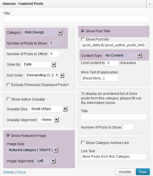
You can use either the Genesis featured posts or pages widget. You could also use another type of widget like a text widget if you like.
More Or Less Widgets
The code above generates 4 widgets in a row however you can easily change the value for the width in the CSS code for more or less.
This will enable you to display 2, 3, 5 or even 6 widgets inline as the code simply uses a percentage.
Here’s the CSS code you can change if you want more or less widgets:
.category-top .widget {
float: left;
padding: 0 2.8%;
width: 33.333333333333%;
}
This CSS code above can be used for 3 widgets.
This CSS code below can be used for 5 widgets:
.category-top .widget {
float: left;
padding: 0 2.8%;
width: 20%;
}
Customization Tips
1. If your post or page titles are too long, rather than select Show Post Title in the widget settings, you could un-check that box and add a custom title to the widget.
This way you can create smaller titles which are the same length which will look better.
2. Why not style each widget differently
3. The image size used in the PHP code is 100px width by 75px height. You can easily change that and regenerate thumbnails if needed. Don’t forget WordPress will generate an image that size for every image you upload.
Responsive Design
The easiest way to make sure these widgets don’t look messed up when viewed on small devices is simply to hide them by adding a couple of lines of CSS to your existing media queries located near the end of your child themes style.css file.
Here’s all the existing CSS code which includes the code to hide the widgets when re-sized on smaller screens:
@media only screen and (max-width: 1139px) {

	.site-inner,
	.wrap {
		max-width: 960px;
	}

	.content-sidebar-sidebar .content-sidebar-wrap,
	.sidebar-content-sidebar .content-sidebar-wrap,
	.sidebar-sidebar-content .content-sidebar-wrap {
		width: 740px;
	}

	.content,
	.site-header .widget-area {
		width: 620px;
	}

	.nav-widget { display: none; }

	.sidebar-content-sidebar .content,
	.sidebar-sidebar-content .content,
	.content-sidebar-sidebar .content {
		width: 400px;
	}

	.footer-widgets-1,
	.footer-widgets-2,
	.footer-widgets-3,
	.sidebar-primary,
	.title-area {
		width: 300px;
	}

		.category-top {
                 display: none;
}

}
Simply add this code to the max-width: 1139px section of your responsive CSS as you can see i’ve done in the code above:
.category-top {
display: none;
}
As soon as the screen reaches a certain width, the widgets will disappear.
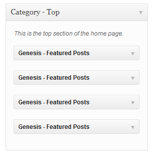
Adding 4 Widgets Instead Of 1

Here’s the 2nd solution which involves registering 4 widgets instead of one:
The same tips and responsive design apply to this method as the first.
Leave a Reply
You must be logged in to post a comment.