Add Full Width Header Image To The Magazine Pro Theme

You can change the PHP code for the Custom Header function located under your Appearance Menu, in your child themes functions.php file around line 42 however you will then need to change the CSS values for your header to match these in your child themes style.css file as well.

Custom Header Image

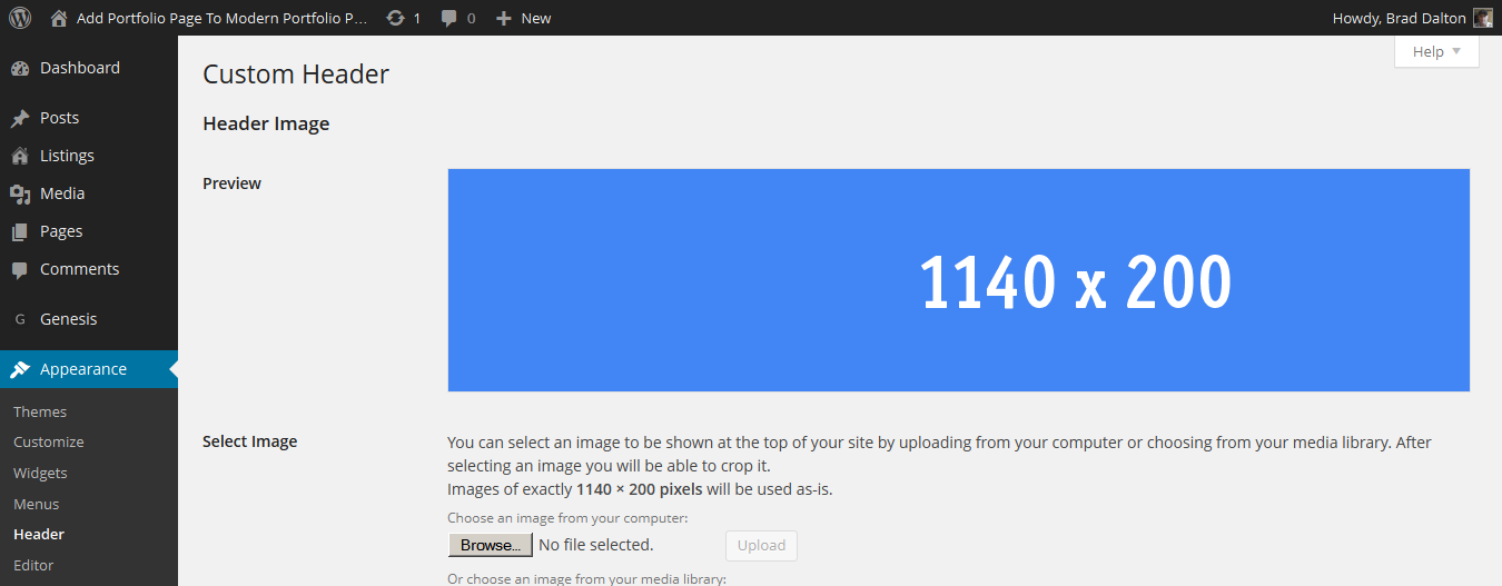
The values in this code have been changed from 90px height and 380px width to 1140px width by 200px height.

//* Add support for custom header
add_theme_support( 'custom-header', array(
	'default-text-color'     => '000000',
	'header-selector'        => '.site-title a',
	'header-text'            => false,
	'height'                 => 200,
	'width'                  => 1140,
) );

Style Sheet

Change the value for the height of your header image ion Line 1173. This example has been changed from the default 90px to 200px.

.header-image .site-title a {
	background-position: center !important;
	background-size: contain !important;
	float: left;
	display: block;
	min-height: 200px;
  	text-indent: -9999px;
	width: 100%;
}

full width header image

You can then remove the top padding above the header image by modifying the values on Line 1106 of your child themes style.css file:

.site-header {
	padding-top: 30px;
	padding-top: 3rem;
}

To remove the padding below your image, change the values on Line 1193

.header-image .site-header .title-area,
.header-image .site-header .widget-area {
	padding: 30px 0;
	padding: 3rem 0;
}

Magazine Pro Header Image

On Line 1111 you’ll find the code for the site header wraps bottom border which you can also remove:

.site-header .wrap {
	border-bottom: 2px solid #222;
	padding: 30px 0;
	padding: 3rem 0;
}

Mobile Responsiveness

See the reply to Bob’s question which includes CSS for Media Queries in the comments below.

Related Tutorials


Comments

13 responses to “Add Full Width Header Image To The Magazine Pro Theme”

  1. hi brad I followed all your instructions and it now shows that the size is 1140×400 on the back end header section but is still displaying as 390×90. Any ideas about what I may have missed?

  2. hi brad I followed all your instructions and it now shows that the size is 1140×400 on the back end header section but is still displaying as 390×90. Any ideas about what I may have missed?

    1. Brad Dalton Avatar
      Brad Dalton

      Your header is displaying correctly in my browser.

      Clear any caching like server side caching, plugin caching and browser caching.

      Add a new image which is exactly the size you want.

      Edit all instances of width and height for the header image under the Site Header section of your child themes style.css file.

      Cannot work out what you have done wrong or missed without seeing all your code.

      The solution in this post produces exactly what you see in the screenshots and only works on one specific theme. Any modifications to this may require another solution.

  3. Eve Batey Avatar

    Brad, thank you so much for this tutorial! You made my life so much easier. You’re the proverbial man, man.

  4. Amanda Taylor Avatar
    Amanda Taylor

    I finally have the size right and I have my header uploaded but for some reason I’m not seeing the header just a bunch of white. I’ve looked all over other forums and I can’t seem to find any help on this.

    1. Brad Dalton Avatar
      Brad Dalton

      Must be a problem with the code.

      1. Amanda Taylor Avatar
        Amanda Taylor

        I think I figured it out. It was missing some code. Once I added that in and tweaked width and height its starting to come around. Not perfect yet but I will get there.

  5. Follow up question. After following your tutorial I was able to get the header to change size but it still floats in the middle ( I think I know how to fix that) and it doesn’t take up the full length of the website. I ended up changing the theme since the client wasn’t happy with the result but would still like to know for future reference.

    Thanks

    1. Brad Dalton Avatar
      Brad Dalton

      Because of this:
      [code]
      background-position: center center !important;
      background-size: contain !important;
      [/code]

  6. Chrissy Avatar

    Thank you for this tutorial Brad, exactly what I was looking for!

  7. Hey Brad, great tutorial, as I know someone that wanted to do this, will have to send them this way. Quick question, does this still work with the responsive design? That was one of the things I was thinking about when they asked to do this. Cheers!

    1. Brad Dalton Avatar
      Brad Dalton

      Hello Bob.

      Good question which i’m glad you asked.

      I didn’t add any Media Queries to this code because different people like their sites to look different on different sized screens.

      The header image will re-size perfectly however the padding may be something some people want to remove, reduce or leave as is.

      Here’s the default view on a 768px width screen.

      Default padding

      Remove Left & Right Padding

      Line 1985 in the style sheet includes this code which adds 5% padding to the left and right of the header on screen sizes of 768px and below. You can simply remove the .site-header class from this rule and the padding is removed but then you still have padding top and bottom which you may or may not want to keep.

      [code]
      @media only screen and (max-width: 768px) {

      .footer-widgets,
      .nav-secondary,
      .site-footer,
      .site-header,
      .site-inner {
      padding-left: 5%;
      padding-right: 5%;
      }
      [/code]

      Here’s what it look like after removing the class for the site-header from the code above:

      removed padding

      Top Padding

      To remove the top padding, Line 1169 includes a min-height value of 200px which you would need to add to your Media Queries and reduce to around 120px.

      [code]
      .header-image .site-title a {
      background-position: center center !important;
      background-size: contain !important;
      display: block;
      float: left;
      min-height: 200px;
      text-indent: -9999px;
      width: 100%;
      }
      [/code]

      This is what i added to max-width 768px in the Media Queries:

      [code]
      .header-image .site-title a {
      min-height: 120px;
      }
      [/code]

      And this is the result which removes the padding when the screen size reaches that width:

      remove top padding

      So its not hard to look at the Media Queries and modify, remove or add values for different header classes so your image looks the way you want it to on different screen sizes.

      1. Very cool… thanks so much. Have sent them the link and enjoy being able to send my clients here who are not code-phobic….

Leave a Reply

Join 5000+ Followers

Get The Latest Free & Premium Tutorials Delivered The Second They’re Published.