
If want your images to display side by side in a row and also re-size so they look great on different sized screens, you’ve got at least 2 options:
- Use PHP code to create multiple custom widgets along with the CSS code to make them display inline.
- Simply use the gallery which uses the responsive code that’s already been developed and included in WordPress
If you use the 1st method, you’ll also need to add CSS code for media queries in that section of your child themes style sheet as well.
The 2nd solution is far easier and likely to produce better quality results.
One of the easiest ways to add images side by side in WordPress is to use the native gallery included in all WordPress installations.
This way you can easily determine:
- How many columns of images you want to display
- How many rows of images
- And the size of each thumbnail image
On top of this, there’s been a huge amount of time and effort put in by a team of people to make the images in a gallery responsive so they look best on any size mobile device.
And it only takes a few minutes to display your images side by side in any theme position, if you’re using Genesis that is.
Here’s the code you can simply paste in your child themes functions.php file to display the images before your content on the front page of your site.
Changing Position
Simply change the hook to change the position your images are displayed on the page:
This code displays your image gallery before your content and doesn’t extend beyond the content area like the above code snippet does.
The hook has been changed from:
genesis_before_content_sidebar_wrapTo:
genesis_before_loopChanging Which Pages Your Gallery Displays On
Simply change the conditional tag to change which pages, posts and archives you want or don’t want your images to display on.
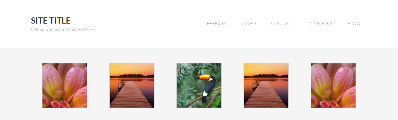
This code displays 5 images in a row before all single posts.
The conditional tag has been changed from:
is_home()To:
is_single()If you test this page, you’ll see for yourself how well the native gallery resize’s images in WordPress.


I think using the native WordPress gallery is a far easier solution than creating widgets side by side and then adding CSS code to your media queries section in your style sheet. What do you think?
Leave a Reply
You must be logged in to post a comment.