
The solution in this download folder enables you to display a custom header image on smaller screens.

As seen in the demo video, your header image will resize to fit any type of mobile device and the header image you add via the customizer will display on desktops.
Demo Video
Shows the mobile.png image from the images folder displaying on smaller screens replacing the image added via the customizer.
Tested using the Gallery Pro theme for StudioPress.
Installation Steps
There’s 3 steps :
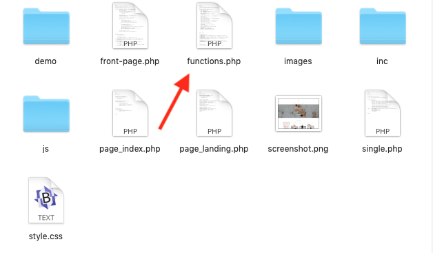
- # Around line 102 – 103 in functions.php, modify the width and height values to match the dimensions of the header image you add via the customize > Header Image setting for your desktop version.
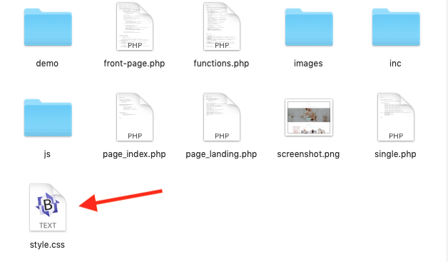
- # Copy & paste the CSS from the style.css file to the end of your Gallery Pro themes style sheet and clear caching. Make sure the max-height and min-width values match the dimensions of the mobile version of your header image.
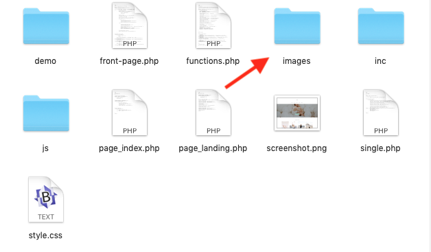
- # Up the mobile version of your header image to your Gallery Pro themes images folder making sure the file name matches Mobile.png which is used in the CSS.
Leave a Reply
You must be logged in to post a comment.