
Trying to get your readers attention can be a major challenge. Even displaying colored buttons doesn’t always increase click thru’s.
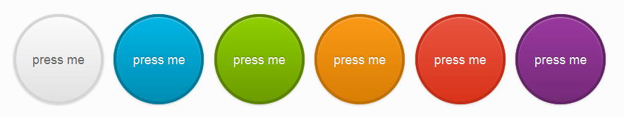
If you’re looking for a highly visible call to action button, why not try a big circle button.
Here’s the CSS code you can simply paste at the end of your child themes style.css file.
.button {
  -webkit-box-shadow: inset 0px 1px 0px rgba(255, 255, 255, 0.5), 0px 1px 2px rgba(0, 0, 0, 0.15);
  -moz-box-shadow: inset 0px 1px 0px rgba(255, 255, 255, 0.5), 0px 1px 2px rgba(0, 0, 0, 0.15);
  box-shadow: inset 0px 1px 0px rgba(255, 255, 255, 0.5), 0px 1px 2px rgba(0, 0, 0, 0.15);
  background-color: #eeeeee;
  background: -webkit-gradient(linear, 50% 0%, 50% 100%, color-stop(0%, #fbfbfb), color-stop(100%, #e1e1e1));
  background: -webkit-linear-gradient(top, #fbfbfb, #e1e1e1);
  background: -moz-linear-gradient(top, #fbfbfb, #e1e1e1);
  background: -o-linear-gradient(top, #fbfbfb, #e1e1e1);
  background: linear-gradient(top, #fbfbfb, #e1e1e1);
  display: -moz-inline-stack;
  display: inline-block;
  vertical-align: middle;
  *vertical-align: auto;
  zoom: 1;
  *display: inline;
  border: 1px solid #d4d4d4;
  height: 32px;
  line-height: 32px;
  padding: 0px 25.6px;
  font-weight: 300;
  font-size: 14px;
  font-family: "HelveticaNeue-Light", "Helvetica Neue Light", "Helvetica Neue", Helvetica, Arial, "Lucida Grande", sans-serif;
  color: #666666;
  text-shadow: 0 1px 1px white;
  margin: 0;
  text-decoration: none;
  text-align: center;
}

.button:hover {
  background-color: #eeeeee;
  background: -webkit-gradient(linear, 50% 0%, 50% 100%, color-stop(0%, #ffffff), color-stop(100%, #dcdcdc));
  background: -webkit-linear-gradient(top, #ffffff, #dcdcdc);
  background: -moz-linear-gradient(top, #ffffff, #dcdcdc);
  background: -o-linear-gradient(top, #ffffff, #dcdcdc);
  background: linear-gradient(top, #ffffff, #dcdcdc);
}

.button:active {
  -webkit-box-shadow: inset 0px 1px 3px rgba(0, 0, 0, 0.3), 0px 1px 0px white;
  -moz-box-shadow: inset 0px 1px 3px rgba(0, 0, 0, 0.3), 0px 1px 0px white;
  box-shadow: inset 0px 1px 3px rgba(0, 0, 0, 0.3), 0px 1px 0px white;
  text-shadow: 0px 1px 0px rgba(255, 255, 255, 0.4);
  background: #eeeeee;
  color: #bbbbbb;
}


input.button, button.button {
  height: 34px;
  cursor: pointer;
}


.button-block {
  display: block;
}


.button.disabled,
.button.disabled:hover,
.button.disabled:active,
input.button:disabled,
button.button:disabled {
  -webkit-box-shadow: 0px 1px 2px rgba(0, 0, 0, 0.1);
  -moz-box-shadow: 0px 1px 2px rgba(0, 0, 0, 0.1);
  box-shadow: 0px 1px 2px rgba(0, 0, 0, 0.1);
  background: #EEE;
  border: 1px solid #dddddd;
  text-shadow: 0 1px 1px white;
  color: #CCC;
  cursor: default;
}


.button-wrap {
  background: -webkit-gradient(linear, 50% 0%, 50% 100%, color-stop(0%, #e3e3e3), color-stop(100%, #f2f2f2));
  background: -webkit-linear-gradient(top, #e3e3e3, #f2f2f2);
  background: -moz-linear-gradient(top, #e3e3e3, #f2f2f2);
  background: -o-linear-gradient(top, #e3e3e3, #f2f2f2);
  background: linear-gradient(top, #e3e3e3, #f2f2f2);
  -webkit-border-radius: 200px;
  -moz-border-radius: 200px;
  -ms-border-radius: 200px;
  -o-border-radius: 200px;
  border-radius: 200px;
  -webkit-box-shadow: inset 0px 1px 3px rgba(0, 0, 0, 0.04);
  -moz-box-shadow: inset 0px 1px 3px rgba(0, 0, 0, 0.04);
  box-shadow: inset 0px 1px 3px rgba(0, 0, 0, 0.04);
  padding: 10px;
  display: inline-block;
}


.button-circle {
  -webkit-border-radius: 240px;
  -moz-border-radius: 240px;
  -ms-border-radius: 240px;
  -o-border-radius: 240px;
  border-radius: 240px;
  -webkit-box-shadow: inset 0px 1px 1px rgba(255, 255, 255, 0.5), 0px 1px 2px rgba(0, 0, 0, 0.2);
  -moz-box-shadow: inset 0px 1px 1px rgba(255, 255, 255, 0.5), 0px 1px 2px rgba(0, 0, 0, 0.2);
  box-shadow: inset 0px 1px 1px rgba(255, 255, 255, 0.5), 0px 1px 2px rgba(0, 0, 0, 0.2);
  width: 120px;
  line-height: 120px;
  height: 120px;
  padding: 0px;
  border-width: 4px;
  font-size: 18px;
}


.button-primary {
  background: -webkit-gradient(linear, 50% 0%, 50% 100%, color-stop(0%, #00b5e5), color-stop(100%, #008db2));
  background: -webkit-linear-gradient(top, #00b5e5, #008db2);
  background: -moz-linear-gradient(top, #00b5e5, #008db2);
  background: -o-linear-gradient(top, #00b5e5, #008db2);
  background: linear-gradient(top, #00b5e5, #008db2);
  background-color: #00a1cb;
  border-color: #007998;
  color: white;
  text-shadow: 0 -1px 1px rgba(0, 40, 50, 0.35);
}

.button-primary:hover {
  background-color: #00a1cb;
  background: -webkit-gradient(linear, 50% 0%, 50% 100%, color-stop(0%, #00c9fe), color-stop(100%, #008db2));
  background: -webkit-linear-gradient(top, #00c9fe, #008db2);
  background: -moz-linear-gradient(top, #00c9fe, #008db2);
  background: -o-linear-gradient(top, #00c9fe, #008db2);
  background: linear-gradient(top, #00c9fe, #008db2);
}

.button-primary:active {
  background: #1495b7;
  color: #005065;
}


.button-action {
  background: -webkit-gradient(linear, 50% 0%, 50% 100%, color-stop(0%, #8fcf00), color-stop(100%, #6b9c00));
  background: -webkit-linear-gradient(top, #8fcf00, #6b9c00);
  background: -moz-linear-gradient(top, #8fcf00, #6b9c00);
  background: -o-linear-gradient(top, #8fcf00, #6b9c00);
  background: linear-gradient(top, #8fcf00, #6b9c00);
  background-color: #7db500;
  border-color: #5a8200;
  color: white;
  text-shadow: 0 -1px 1px rgba(19, 28, 0, 0.35);
}

.button-action:hover {
  background-color: #7db500;
  background: -webkit-gradient(linear, 50% 0%, 50% 100%, color-stop(0%, #a0e800), color-stop(100%, #6b9c00));
  background: -webkit-linear-gradient(top, #a0e800, #6b9c00);
  background: -moz-linear-gradient(top, #a0e800, #6b9c00);
  background: -o-linear-gradient(top, #a0e800, #6b9c00);
  background: linear-gradient(top, #a0e800, #6b9c00);
}

.button-action:active {
  background: #76a312;
  color: #374f00;
}


.button-highlight {
  background: -webkit-gradient(linear, 50% 0%, 50% 100%, color-stop(0%, #fa9915), color-stop(100%, #d87e04));
  background: -webkit-linear-gradient(top, #fa9915, #d87e04);
  background: -moz-linear-gradient(top, #fa9915, #d87e04);
  background: -o-linear-gradient(top, #fa9915, #d87e04);
  background: linear-gradient(top, #fa9915, #d87e04);
  background-color: #f18d05;
  border-color: #bf7004;
  color: white;
  text-shadow: 0 -1px 1px rgba(91, 53, 2, 0.35);
}

.button-highlight:hover {
  background-color: #f18d05;
  background: -webkit-gradient(linear, 50% 0%, 50% 100%, color-stop(0%, #fba42e), color-stop(100%, #d87e04));
  background: -webkit-linear-gradient(top, #fba42e, #d87e04);
  background: -moz-linear-gradient(top, #fba42e, #d87e04);
  background: -o-linear-gradient(top, #fba42e, #d87e04);
  background: linear-gradient(top, #fba42e, #d87e04);
}

.button-highlight:active {
  background: #d8891e;
  color: #8d5303;
}


.button-caution {
  background: -webkit-gradient(linear, 50% 0%, 50% 100%, color-stop(0%, #e8543f), color-stop(100%, #d9331a));
  background: -webkit-linear-gradient(top, #e8543f, #d9331a);
  background: -moz-linear-gradient(top, #e8543f, #d9331a);
  background: -o-linear-gradient(top, #e8543f, #d9331a);
  background: linear-gradient(top, #e8543f, #d9331a);
  background-color: #e54028;
  border-color: #c22d18;
  color: white;
  text-shadow: 0 -1px 1px rgba(103, 24, 13, 0.35);
}

.button-caution:hover {
  background-color: #e54028;
  background: -webkit-gradient(linear, 50% 0%, 50% 100%, color-stop(0%, #eb6855), color-stop(100%, #d9331a));
  background: -webkit-linear-gradient(top, #eb6855, #d9331a);
  background: -moz-linear-gradient(top, #eb6855, #d9331a);
  background: -o-linear-gradient(top, #eb6855, #d9331a);
  background: linear-gradient(top, #eb6855, #d9331a);
}

.button-caution:active {
  background: #cd5240;
  color: #952312;
}


.button-royal {
  background: -webkit-gradient(linear, 50% 0%, 50% 100%, color-stop(0%, #99389f), color-stop(100%, #752a79));
  background: -webkit-linear-gradient(top, #99389f, #752a79);
  background: -moz-linear-gradient(top, #99389f, #752a79);
  background: -o-linear-gradient(top, #99389f, #752a79);
  background: linear-gradient(top, #99389f, #752a79);
  background-color: #87318c;
  border-color: #632466;
  color: white;
  text-shadow: 0 -1px 1px rgba(26, 9, 27, 0.35);
}

.button-royal:hover {
  background-color: #87318c;
  background: -webkit-gradient(linear, 50% 0%, 50% 100%, color-stop(0%, #ab3eb2), color-stop(100%, #752a79));
  background: -webkit-linear-gradient(top, #ab3eb2, #752a79);
  background: -moz-linear-gradient(top, #ab3eb2, #752a79);
  background: -o-linear-gradient(top, #ab3eb2, #752a79);
  background: linear-gradient(top, #ab3eb2, #752a79);
}

.button-royal:active {
  background: #764479;
  color: #3e1740;
}
Or you could get clever and add the code to a second style sheet.
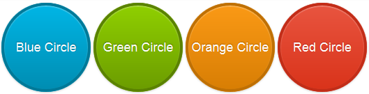
Once you’ve added the code, all you need to do is copy and paste the HTML for a button into your WordPress text editor.
<a href="#" class="button button-circle">Silver Circle</a>
<a href="#" class="button button-circle button-primary">Blue Circle</a>
<a href="#" class="button button-circle button-action">Green Circle</a>
<a href="#" class="button button-circle button-highlight">Orange Circle</a>
<a href="#" class="button button-circle button-caution">Red Circle</a>
<a href="#" class="button button-circle button-royal">Purple Circle</a>
Prefer to make your own buttons?
Here’s a few of the best free online CSS 3 Button Generators which make the job easy.
Otherwise you may prefer to simply install a plugin for making buttons.
Check out the live code demo on CODEPEN
Source: Alex Wolfe
Leave a Reply
You must be logged in to post a comment.