This tutorial includes the work a client hired me for recently.
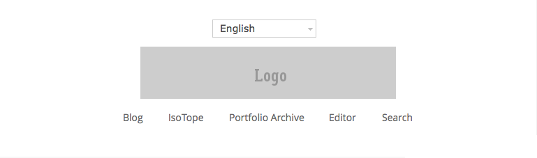
Here’s what the client wanted:
And here’s how the client wanted the header to look on smaller screens:
The work involved:
- Modification of the custom header function
- Addition of 2 widgets before the header
- Use of search widget and text widget in the before header left widget
- Use of the language selector in the right before header widget
- Addition of CSS for media queries
- Modifications made to default CSS
Hi Brad-
How would I simply center it on all screens/devices? I have a natural image size of 768X 160. The Theme shrinks the size down. So I had to enlarge it to ensure that it was croppable to the 768x 160. I have been able to this but not able to center it.
I can provide you with the website link via private email, so that you may see what it look like now.
here is the code i used: (functions.php ) width of 1140 and height of 180 were used to allow the image to be able to not shrunken down from its original size of 768 X 163.
What I added on my own. and doesn’t do anything.
Please let me know if you have a solution for this.
Thank you.
Becky
Link to a live site please so i can inspect the CSS.
Hi Brad- I have sent you the credentials via email. Thank you.