
In this tutorial, we’ll start with the default header and end up with a full width header image.
Update: Here’s a better solution tested on the latest version of Lifestyle Pro Responsive Full Header Image
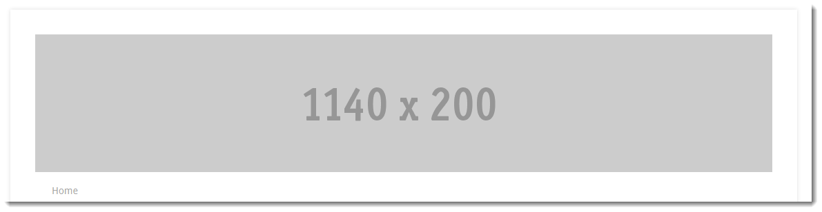
Here’s the default header area of the Lifestyle Pro theme by StudioPress:

And here’s what a full width header image looks like:
The first step is to find this code in your child themes functions.php file and change the values for the width and height.
//* Add support for custom header
add_theme_support( 'custom-header', array(
'header_image' => '',
'header-selector' => '.site-title a',
'header-text' => false,
'height' => 200,
'width' => 1140,
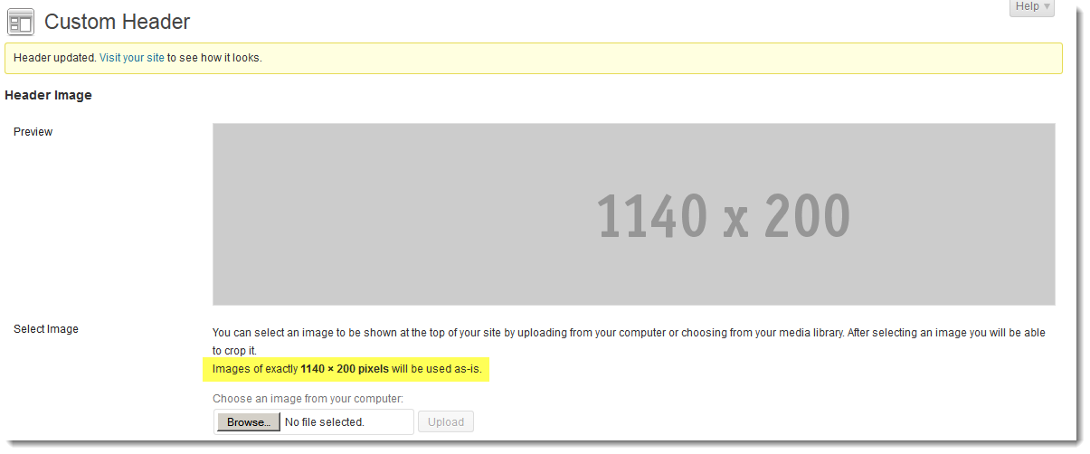
) );In this example we’ll be using an image which is 1140px width by 200px height so the custom header settings need to match these dimensions.
Next step is to go to Appearance > Header and upload your header image using the Custom Header feature.
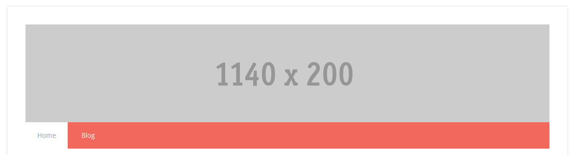
Here’s an example of what your header area may look like now:
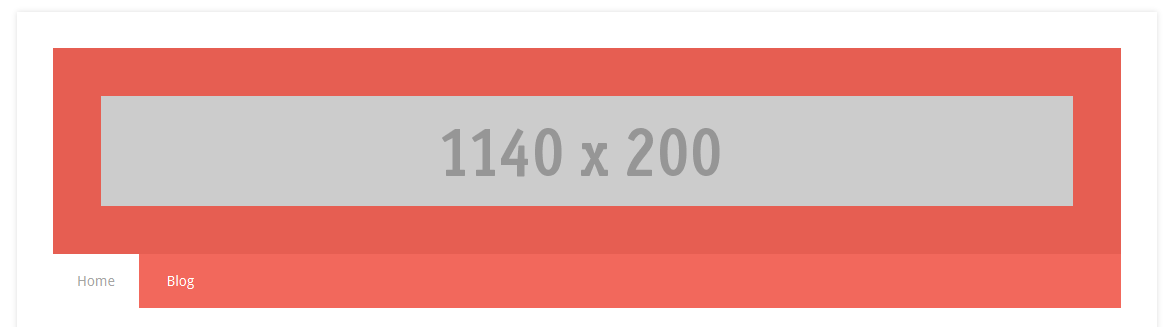
The reason your header image isn’t filling up the entire header container is because there’s some CSS code adding a fairly hefty amount of padding on all 4 sides.
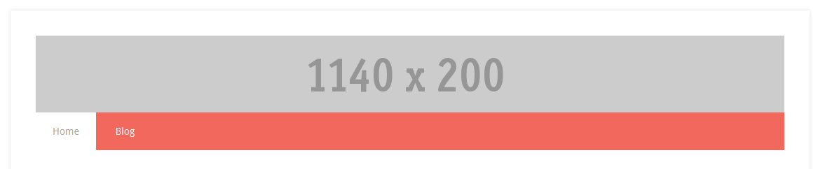
Reduce the padding to zero in the following CSS rule on line 1078.
.site-header {
	background-color: #27968b;
	padding: 0;
	overflow: hidden;
}
And here’s the result:
The value for the height in the default CSS code needs increasing so you can modify the default CSS rule as follows on line 1142 so the min-height matches your image.
.header-image .site-title a {
	background-size: contain !important;
	float: none;
	min-height: 200px;
	width: 100%;
}
And here’s the result now:
You may want to change the background color of the secondary nav menu so here’s some basic sample code you can modify to your own liking:
.genesis-nav-menu {
    clear: both;
	background-color: white;
	color: #333;
}
Here’s the final result which you should be happy with otherwise do let me know in the comments if its not exactly what you wanted.

Different Background Colors
Changing the background color of your header is easy. Simply add this code to the end of your child themes style.css file:
.lifestyle-pro-blue .site-header {
    background-color: #fff;
}
This code works if you have selected the green color style from the Genesis > Theme Settings > Color Style.

You will need to change the first class in this rule to match the color you have selected from the above settings.
Example: If you’ve chosen green, your code would look like this:
.lifestyle-pro-green .site-header {
    background-color: #fff;
}
Otherwise, simply use this for the default:
.site-header {
    background-color: #fff;
}
And this if you get stuck as a last resort:
.site-header {
    background-color: #fff!important;
}
Change Font Color After Change Background
You will also need to change the font color for the secondary nav menu if your change the background color because the color is white by default:
.nav-secondary {
    	background-color: white;
}

.lifestyle-pro-red .archive-pagination li a,
.lifestyle-pro-red .genesis-nav-menu .current-menu-item > a,
.lifestyle-pro-red .genesis-nav-menu .sub-menu a,
.lifestyle-pro-red .nav-secondary a {
	color: #a5a5a3;
}
Header Right Widget
Mobile Responsive Solution
Is your image cutoff or not displaying correctly on smaller screen widths?
Click here to use one solution which shows you how to easily add different images which display on different screen widths.
Leave a Reply
You must be logged in to post a comment.