
If you’ve installed the latest Genesis theme framework, you’ll notice the style.css file now includes font size values in both rem and pixels.
The same is true in the new Twenty Twelve default theme for WordPress.
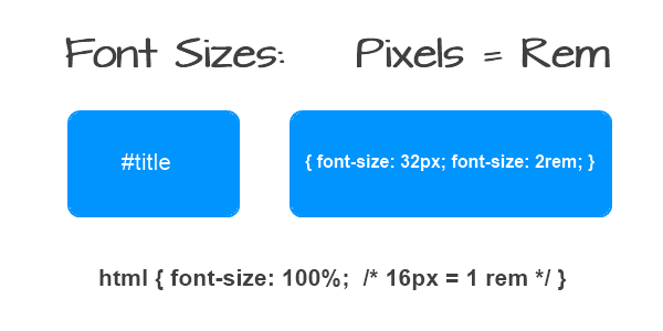
The new unit value for font sizes is rem with a pixel fallback to support all browsers.
Example:
{ font-size: 16px; font-size: 1rem; }

The size has been set so 1 rem = 16 pixels

The $rembase therefore is 16

html {
font-size: 100%; /* 16px browser default */
}
Here’s the table which is included in the Genesis 1.9 style sheet
12 / 16 = 0.75rem
14 / 16 = 0.875rem
16 / 16 = 1rem
18 / 16 = 1.125rem
20 / 16 = 1.25rem
24 / 16 = 1.5rem
30 / 16 = 1.875rem
36 / 16 = 2.25rem
48 / 16 = 3rem
Changing REM Value (base)
The base value of 1 rem unit can be changed like this:
html { font-size:62.5%; /* 10px browser default */
}
In this case the value of 1 rem = 10 pix
Changing Font Sizes in Different Themes
You’ll need to find out what font size the theme is using relative to the html root. Not all themes will use 100% font size meaning 1 rem will not always equal 16pixels.
When you change the font size for pixels, you’ll need to change the rem size also.
Twenty Twelve Theme Rem Base
The latest default theme, Twenty Twelve is using a rembase of 14
Here’s some examples from the style sheet of 2012
/* Twenty Twelve Theme Rem Values
--------------------------------------------------------------
This stylesheet uses rem values with a pixel fallback. The rem
values (and line heights) are calculated using two variables:

$rembase: 14;
$line-height: 24;

---------- Examples

* Use a pixel value with a rem fallback for font-size, padding, margins, etc.
padding: 5px 0;
padding: 0.357142857rem 0; (5 / $rembase)

* Set a font-size and then set a line-height based on the font-size
font-size: 16px
font-size: 1.142857143rem; (16 / $rembase)
line-height: 1.5; ($line-height / 16)

---------- Vertical spacing

Vertical spacing between most elements should use 24px or 48px
to maintain vertical rhythm:

.my-new-div {
margin: 24px 0;
margin: 1.714285714rem 0; ( 24 / $rembase )
}
Is Rem Better Than Pixels?
I think the reason theme developers are now starting to use rem is because of the scaling for mobile devices. On top of this, you get more browser support when using both font units.
Clearly, not all themes are using the same rem base.
How about you?
Do you use rem or pixels?
Learn More About Font Sizing
Leave a Reply
You must be logged in to post a comment.