Full Width Featured Image After Header In Genesis

This code enables you to display your featured image, full width, after the header, on single posts. If no featured image is added, a default image named default.png is displayed which you can add via the customizer and/or child themes images folder.

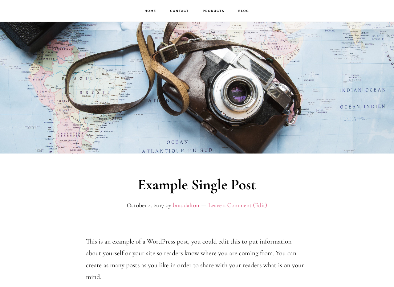
Here’s what the image looks like tested using the Infinity Pro child theme by StudioPress :

Here’s the demo video showing the responsiveness of the image regardless of size on different sized screens :

Video Demo

Shows the default image added via the customizer displaying after the header when no featured image is added to a single post. Shows the image display full width on all screen sizes.

Code Installation

There’s 3 simple steps once you have access to the files in the download folder :

Step 1 : From the download folder, upload the file named single to your child themes root directory.

Step 2 : From the download folder, upload the folder named image-script to your child themes root directory.

Step 3 : From the download folder, copy & paste the CSS to the end of your child themes style.css file and modify the value for the height property to suit your own requirements.

You can then set a default image using the Featured Image setting in the customizer.

Register or login to access the download folder for members :

Related Tutorials


Comments

9 responses to “Full Width Featured Image After Header In Genesis”

  1. Debbie Hastings Avatar
    Debbie Hastings

    Hi Brad.

    This works great except it’s not responsive. the image isn’t placed as a background image – is placed as an absolute position, so where would you put background-size: contain?

    1. You should need any CSS if you use this method https://wpsites.net/web-design/add-image-after-header-in-genesis/#method-1-template

      However, if you want to use background-size: contain; use it like this :

      [code]
      .after-header {
      background-size: contain;
      }
      [/code]

      1. Debbie Hastings Avatar
        Debbie Hastings

        I used the method described above. Is there a way to get that method to be responsive? I used the functions.php option above to add the featured image instead of the single.php.

        1. Are you wanting to use 1 image only or the featured from for each single post/page?

          1. Debbie Hastings Avatar
            Debbie Hastings

            featured image.

          2. Try this solution https://wpsites.net/web-design/responsive-text-over-image/

            Otherwise, i do have a new solution i’ll publish tomorrow which enables you to use width:100%;

  2. Jeff Evans Avatar

    Thanks for this. Have an issue with mobile though. It doesn’t re-size the width and my image is cutoff. I updated the backstretch.js to the most current version, but it did not help the issue. I also noticed an unanswered question on GitHub regarding this issue as well. Any suggestions? I can hide the image with css on mobile, but really don’t want to do that.

      1. Jeff Evans Avatar

        Thanks for replying so quickly. It looks like I got it straightened out with some css tweaking. Here’s the link to the site. Can’t direct link to the page because its hidden, but if you click on the “about us” link, you can check it out. Seems to be good now. Thanks for this site. Really appreciate the resources.

        https://newtempwebsite.net/franchise/idolize2

Leave a Reply

Join 5000+ Followers

Get The Latest Free & Premium Tutorials Delivered The Second They’re Published.