
This tutorial provides the CSS & CSS for Media Queries for 2 different solutions which enable you to display popular posts in columns.
You can use a plugin like WordPress Popular Posts or a modified version of the Genesis Featured Posts widget which includes a option to display posts by page views.
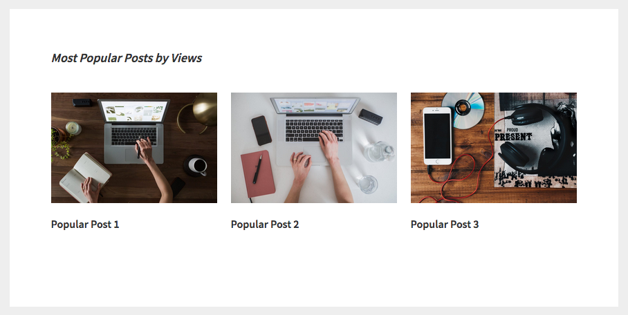
Here’s an example of what you get when using the modified version of the Genesis Featured Posts widget :
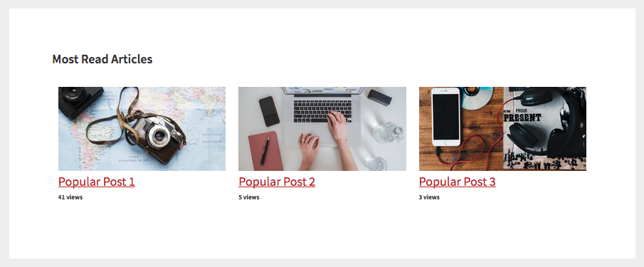
Here’s an example of what you get when using the WordPress Popular Posts plugin with nil styling :
CSS For Genesis Featured Posts Widget ( Modified )
Use CSS like this ( which supports both CSS Grid & all versions of browsers like MS I.E, Edge & Opera Mini ) to display each entry in a column when using the Genesis Featured Posts Widget ( Modified Version ) :
@supports not (display: grid) {

    .after-entry .entry {
        display: inline-block;
        width: 31%;
        margin: 1.16666666667%;
    }

    @media only screen and (max-width: 960px) {

        .after-entry .entry {
            display: block;
            width: 100%;
        }

    }

}

.after-entry .widget-title {
    grid-area: header;
}

.after-entry .entry:first-of-type {
    grid-area: one;
}

.after-entry .entry:nth-of-type {
    grid-area: two;
}

.after-entry .entry:last-of-type {
    grid-area: three;
}

.after-entry .widget-wrap {
        display: grid;
        grid-template-columns: 1fr 1fr 1fr;
        grid-gap: 20px;
        grid-template-areas:
            'header header header'
            'one two three';
}

@media only screen and (max-width: 1340px) {

    .after-entry .widget-wrap {
        grid-template-columns: 1fr 1fr;
        grid-template-areas:
            'header header'
            'one two'
            'three three';
    }

}

@media only screen and (max-width: 960px) {

    .after-entry .widget-wrap {
        grid-template-columns: 1fr;
        grid-template-areas:
            'header'
            'one'
            'two'
            'three';
    }

}
Note : Edge will support CSS Grid from the 17/10/2017
The 1st solution also enables you to display posts in columns using the default Genesis featured posts widget with CSS Grid which makes it easy to control the size and order of each popular post.
You can also code your grid areas for each entry or post like this :
.after-entry .entry:nth-of-type(1) {
    grid-area: one;
}

.after-entry .entry:nth-of-type(2) {
    grid-area: two;
}

.after-entry .entry:nth-of-type(3) {
    grid-area: three;
}
CSS For WordPress Popular Posts Plugin
Use this CSS if using the WordPress Popular Posts plugin by Hector C :
.after-entry .popular-posts li {
        float: left;
        clear: none;
        width: 31%;
        margin: 1.16666666667%;
}


@media only screen and (max-width: 680px) {

    .after-entry .popular-posts li {
        float: none;
        width: 100%;
        margin: 0;
    }

}
Assumes the use of the After Entry widget in Genesis which uses the .after-entry class.
Leave a Reply
You must be logged in to post a comment.