• Skip to primary navigation
  • Skip to main content
  • Skip to primary sidebar

WP SITES

2785

Original Genesis & WooCommerce Tutorials & 6000+ Guaranteed Code

Snippets

  • Try Premium
  • Log in

Hero Image Behind Site Header & Menu On Front Page In Genesis Sample Theme

This tutorial enables you to add a hero image with overlaying content behind your site header and nav menu like this :

Tested using the latest version of the Genesis Sample child theme by StudioPress, this solution works with or without Gutenberg blocks on the home page.

Demo Video

Shows a full screen width image behind the site header and menu in the Genesis Sample theme. Shows the image can be changed using the Hero Image setting in the customizer. Displays HTML content from the Hero Text widget area.

Installation Steps

There’s 4 steps :

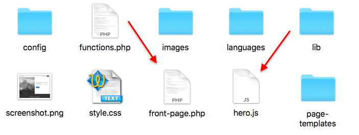
  1. # Upload the files named front-page.php and hero.js to the your theme folder like this :
  2.  

    Step 1

  3. # Copy & paste the PHP code from functions.php file to the end of your Genesis Sample themes functions file
  4.  

    Step 2

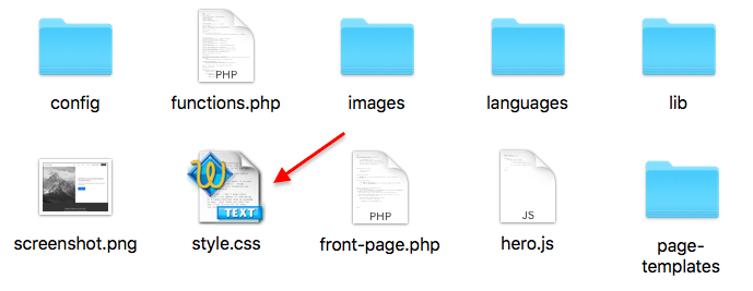
  5. # Copy & paste the CSS from the style.css file to the end of your themes style sheet and clear caching.
  6.  

    Step 3

  7. # From your WordPress Dashboard, go to Appearance > Widgets and copy the demo HTML for the hero text into a HTML widget in the Hero Text widget area.
  8.  

    Step 4

Once you’ve completed the steps, you can then add a image using the customizer or upload an image file named hero.jpg directly to your child themes images folder.

Download Folder

Related Tutorials

  • Hero Image Behind Site Header & Menu With Text Overlay In Genesis Sample Theme
  • Hero Image Behind Site Header & Menu With Unique Text Overlay In Genesis Sample Theme

After Header Image Header Image jQuery Scroll

Reader Interactions

Comments

  1. Lobsang Wangdu says

    November 17, 2021 at 9:34 pm

    I have two issues with this front page hero image. There is space top of the hero image on the Chrome and Firefox. It doesn’t work with Safari at all. Can you help about this issue? Here is the url: https://wcscl.wpengine.com/

    Log in to Reply
    • Brad Dalton says

      November 18, 2021 at 4:48 am

      Hello Lobsang

      As seen in the demo video, it works perfectly.

      Please clear caching as instructed in the installation steps and turn off minification so i can take a look at where you added the CSS.

      Otherwise, send me a copy of your theme with the code installed.

      I installed the code in a fresh copy of Genesis Sample 3.4.2 and tested it using Chrome, MS Edge, Firefox & Safari

      https://youtu.be/By0ms50bao0

      Thanks.

      Log in to Reply
  2. Tim Baggaley says

    November 3, 2021 at 2:50 pm

    Hello,
    I’ve just downloaded the folder and it does not have the front-page.php in it. I’ve got the acf.json, functions.php, hero.js and style.css but that’s it.
    Please advise
    Tim

    Log in to Reply
    • Brad Dalton says

      November 3, 2021 at 3:27 pm

      It’s in there, i checked the download folder. There’s no .json file for this tutorial.

      Log in to Reply
    • Tim Baggaley says

      November 4, 2021 at 4:19 pm

      Apologies, Brad, I see the front-page.php file is there and I’ve confused two different Hero Image installations.

      Log in to Reply
      • Brad Dalton says

        November 4, 2021 at 4:57 pm

        Yes i normally publish multiple tutorials using different methods but this one doesn’t use ACF.

        Log in to Reply
  3. Jonathon Fowler says

    April 4, 2021 at 8:09 pm

    Hi, how do I get the text on the hero image overlay to wrap properly on mobile devices? When I view my homepage https://loveweddingphotosandfilm.co.uk on a mobile device, the word ‘Wedding’ has the letter ‘g’ moved down onto the next line – the text reads:

    Love
    Weddin
    G Photos
    And
    Film

    How do I get the letter ‘g’ to not drop onto the next line without reducing the font size?

    Thank you.

    Log in to Reply
    • Brad Dalton says

      April 5, 2021 at 6:46 am

      You could remove the left and right padding

      @media only screen and (max-width: 480px) {
      
          .hero-image .wrap {
              padding-left: 0;
              padding-right: 0;
          }
      
      }
      Log in to Reply
      • Jonathon Fowler says

        April 7, 2021 at 6:14 pm

        Hi, that worked just great, thank you.

        Log in to Reply
  4. Jonathon Fowler says

    April 4, 2021 at 4:15 pm

    Hi Brad,

    When I add the hero image I notice that my homepage fails the Cumulative Layout SHift test on pagespeed insights.

    Can this be fixed so I can still use a hero image but pass the CLS test?

    This is important as from next month, Google is taking CLS into account in its ranking algo.

    Many thanks.

    Log in to Reply
    • Jonathon Fowler says

      April 4, 2021 at 7:35 pm

      Resolved – I’d been tweaking the CSS but resetting it back to default resulted in CLS score of zero. Perfect.

      Log in to Reply
  5. Joelle Reeder says

    March 2, 2021 at 5:54 pm

    Hello! 🙂 This works great except I’m getting like a 30px gap at the top. The theme hasn’t been changed much yet, so I’m not sure what’s causing that. Any ideas? No changes were made to the standard sample theme in terms of the site header or anything and I can’t seem to find anything in the CSS that indicates a gap or a positioning issue. The image may not be the exact same dimensions, though, so perhaps that’s it?

    Log in to Reply
    • Brad Dalton says

      March 2, 2021 at 5:58 pm

      Where’s the gap? Please link to your site. You may be using a different version of Sample to the one the code is tested in so you’ll need to add/modify the CSS.

      Log in to Reply
    • Joelle Reeder says

      March 2, 2021 at 6:07 pm

      Ah. I had to adjust the CSS here:

      @media only screen and (min-width: 960px)
      .hero-active .site-container {
      top: -73px;
      position: absolute;
      }

      Making it -100 fixed the issue. 🙂

      Log in to Reply
      • Joelle Reeder says

        March 2, 2021 at 6:29 pm

        Hi, its me again. 🙂 Curious, on interior pages, it’s not showing a white background on the site header as you scroll down the page, which does pose an issue. Is there a way to ensure that happens on all the pages? Thank you!

        Log in to Reply
        • Brad Dalton says

          March 2, 2021 at 7:07 pm

          This tutorial clearly states front page.

          Log in to Reply
          • Joelle Reeder says

            March 2, 2021 at 9:19 pm

            Okay, cool. I figured there might be a solution that was simple or someone else might’ve asked about it. That’s fine. I’ll figure it out.

          • Joelle Reeder says

            March 2, 2021 at 9:33 pm

            FWIW, I just set the main site-header background back to #fff and that seems to resolve it. I was concerned that would override the hero stuff, but it didn’t based on where I placed your CSS. In case anyone else runs into this.

  6. Jonathon Fowler says

    December 20, 2020 at 6:06 pm

    I was previously using Layerslider, and it would display the full height of the image even on a mobile device, as you move up to larger screens, such as my desktop, the image would display more of the width, and if you rotate the screen to landscape proportions,m it would display the entire image.

    How do I change CSS to display full height, the above doesn’t work on all proportions of screen? Thank you.

    Log in to Reply
    • Brad Dalton says

      December 21, 2020 at 10:37 am

      I don’t have the CSS for this as its something i would need to spend some time on to work out but it would involve modifying the default CSS i provided with new values in order to work with your new image size. I do provide limited PHP modification support included in membership at no additional charge however CSS modifications are either billable or something you will need to spend time on yourself.

      Log in to Reply
  7. Jonathon Fowler says

    December 20, 2020 at 9:58 am

    Thanks, I did that, and it works up to about 90% full screen, then when I go full screen it cuts off the bottom of the image – it’s like it wants to do full width but not full height.

    Log in to Reply
  8. Jonathon Fowler says

    December 18, 2020 at 6:54 pm

    Hi, the default hero image size is 1600 x 800, how do I change this to accommodate a larger image, say 1920 x 1080? Thanks.

    Log in to Reply
    • Brad Dalton says

      December 19, 2020 at 2:37 am

      Link to your site please. You can change the values in the CSS.

      Log in to Reply
      • Jonathon Fowler says

        December 19, 2020 at 8:21 am

        Hi Brad, it’s https://loveweddingphotosandfilm.co.uk/

        Log in to Reply
        • Jonathon Fowler says

          December 19, 2020 at 8:22 am

          Ideally, I want to be able to add an image with the proportions of 6 x 4, thank you.

          Log in to Reply
          • Brad Dalton says

            December 20, 2020 at 7:53 am

            Try changing the value for the height in this CSS rule

            .hero-image {
                height: 100vh;
            }
          • Jonathon Fowler says

            December 20, 2020 at 9:38 am

            Thanks. I already have this in my css file:

            .hero-image {
              background-image: linear-gradient(rgba(0, 0, 0, 0.0), rgba(0, 0, 0, 0.5)), url("https://loveweddingphotosandfilm.co.uk/wp-content/uploads/Wedding-Photo-Of-The-Year-Edinburgh-Wedding-Photographer-Balmoral-Hotel-Wedding.jpg");
              height: 100%;
              background-position: center;
              background-repeat: no-repeat;
              background-size: cover;
              position: relative;
            }

            I tried changing height: 100% to height: 100vh; but the image still doesn’t display full height, it’s cropping the image when viewed on a desktop.

          • Brad Dalton says

            December 20, 2020 at 9:45 am

            Add another rule after that one and clear caching. It worked when i tested it in the browser.

  9. Kandyce Clark says

    June 3, 2020 at 4:21 am

    ok! I will double check and make sure I did not mess up any code because it is not showing up transparent for me after uploading my logo

    Log in to Reply
    • Brad Dalton says

      June 3, 2020 at 4:39 am

      If you also want it transparent on scroll, add this CSS to the end of your style sheet and clear caching :

      @media only screen and (min-width: 960px) {
      
          .white .site-header {
              background-color: transparent!important;
          }
      
      }
      Log in to Reply
  10. Kandyce Clark says

    June 3, 2020 at 3:16 am

    Not sure whats going on, but i followed the steps exactly and the image is not showing

    Log in to Reply
    • Brad Dalton says

      June 3, 2020 at 3:20 am

      I emailed you a copy of the text theme which includes the code installed. Did you add a widget to the widget area? Otherwise please send me FTP access.

      Log in to Reply
      • Kandyce Clark says

        June 3, 2020 at 3:36 am

        Thanks for sending it! It is working perfectly now! 🙂

        Log in to Reply
      • Kandyce Clark says

        June 3, 2020 at 3:46 am

        I’m sorry actually is there a way to make the header transparent when a logo image is present?

        Log in to Reply
        • Brad Dalton says

          June 3, 2020 at 3:57 am

          The site header is transparent when a logo is added using Customize > Site Identity > Logo

          Log in to Reply

Leave a Reply Cancel reply

You must be logged in to post a comment.

Primary Sidebar

Code written by Brad Dalton specialist for Genesis, WooCommerce & WordPress theme customization. Read More…

Advertise · WPEngine · Genesis · Log in

  • Access Problems
  • Account Details
  • Consulting
  • Tags
 

Loading Comments...
 

You must be logged in to post a comment.