
Using the Genesis Sample child theme for example, we’ll change the width of the content area and sidebar as well as the site inner and wrap classes.
This tutorial is based on a question from a member of WP Sites.
Under the Structure and Layout section of the Genesis Sample themes style.css file, you’ll find the CSS rules which need modifying.
Note: The solution in this post requires you to modify the default CSS rather than add the CSS to your child themes style sheet. CSS may need tweaking for use on other themes.
Firstly. here’s the default layout of content sidebar:
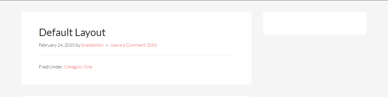
And here’s the CSS for the default widths:
.site-inner,
.wrap {
    margin: 0 auto;
    max-width: 1200px;
}

.content {
    float: right;
    width: 800px;
}

.sidebar-primary {
    float: right;
    width: 360px;
}
Smaller Content – Bigger Sidebar
Lets start with making the content area smaller and the primary sidebar larger, keeping the width of site inner and wrap to the defaults.
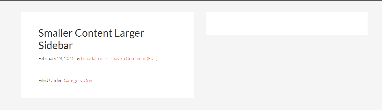
You only need to change the value’s for the .content and .sidebar-primary classes to what you see in the following CSS rules:
.content {
    float: right;
    width: 600px;
}

.sidebar-primary {
    float: right;
    width: 560px;
}
This increases the value for the .primary-sidebar width by the same amount as you decrease the width for the .content class.
Default Wrap – Smaller Content & Smaller Sidebar
Next we’ll decrease the content sidebar width using a smaller value for the .content class and smaller value for the .primary-sidebar class.
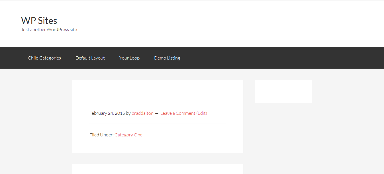
.site-inner {
    margin: 0 auto;
    max-width: 840px;
}

.wrap {
    margin: 0 auto;
    max-width: 1200px;
}
The above CSS reduces the width for the .site-inner class by 360px so we’ll need to reduce the width for the .content and .primary-sidebar classes by the same amount:
.content {
    float: right;
    width: 600px;
}

.sidebar-primary {
    float: right;
    width: 200px;
}
The above CSS shows you the width for the .content class has reduced from 800px to 600px and the width for the .sidebar-primary class has reduced from 360px to 200px.
Smaller Site Inner & Wrap
This last solution enables you to create a smaller content area, smaller primary sidebar and also reduce the width of the .site-inner and .wrap classes like you see in the following screen shot.
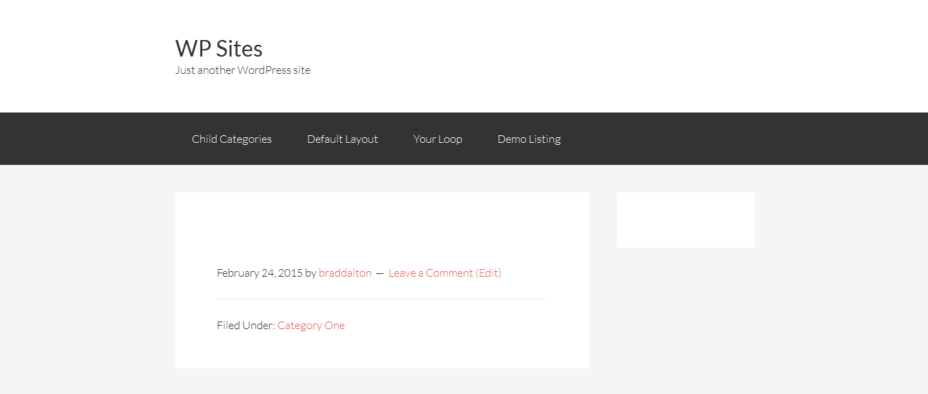
.site-inner,
.wrap {
    margin: 0 auto;
    max-width: 840px;
}

.content {
    float: right;
    width: 600px;
}

.sidebar-primary {
    float: right;
    width: 200px;
}
Leave a Reply
You must be logged in to post a comment.