
This download includes the code which enables you to display a different background image for any widget area on mobiles.
In this case, you can use the code in this tutorial to display a specific part of the image on mobile screens which is the person positioned in the bottom right of the original image.
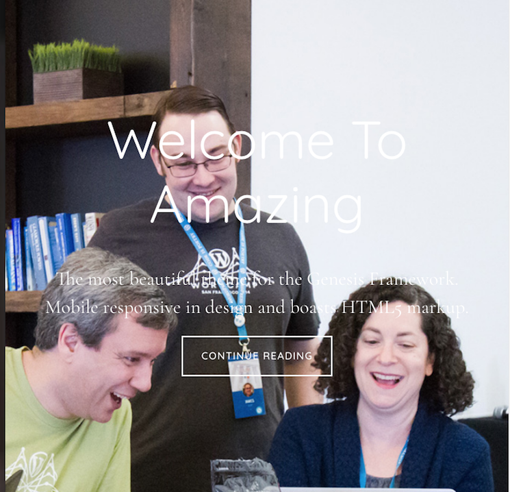
Here’s the images used in the demo video :


Watch Demo Video #
Tested using the Home Section 1 widget area in Parallax Pro however will work in any Genesis child theme by changing the CSS classes.
Replaces the bg-1.jpg background image from the parallax-pro > images folder for home-section-1 with mobile.jpg when the screen width reaches 680px width.
Installation #
There’s 3 steps relating to usage of the files in the download folder :
Step 1 : Upload the front-page.php file to the Parallax Pro themes root directory replacing the default front page template. This file includes additional code on line 60 only which you can use in any other Genesis child theme.
Leave a Reply
You must be logged in to post a comment.