
Both code snippets in this tutorial enable you to pin the footer of your site to the bottom of the viewport like this:
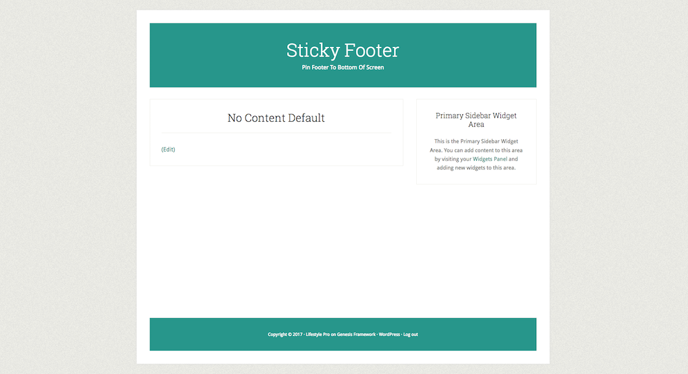
This prevents big gaps on pages with little or no content like this:

The example above was tested using the Lifestyle Pro child theme by StudioPress.
Here’s the CSS you can add to your child themes style.css file before the start of the Media Queries:
.site-container-wrap {
    display: flex;
    min-height: 100vh;
    flex-direction: column;
}

.site-inner {
    flex: 1;
}Note : Both these solutions may or may not need modifying for use on other genesis or non genesis child themes.
Sticky Footer On Larger Screens Only
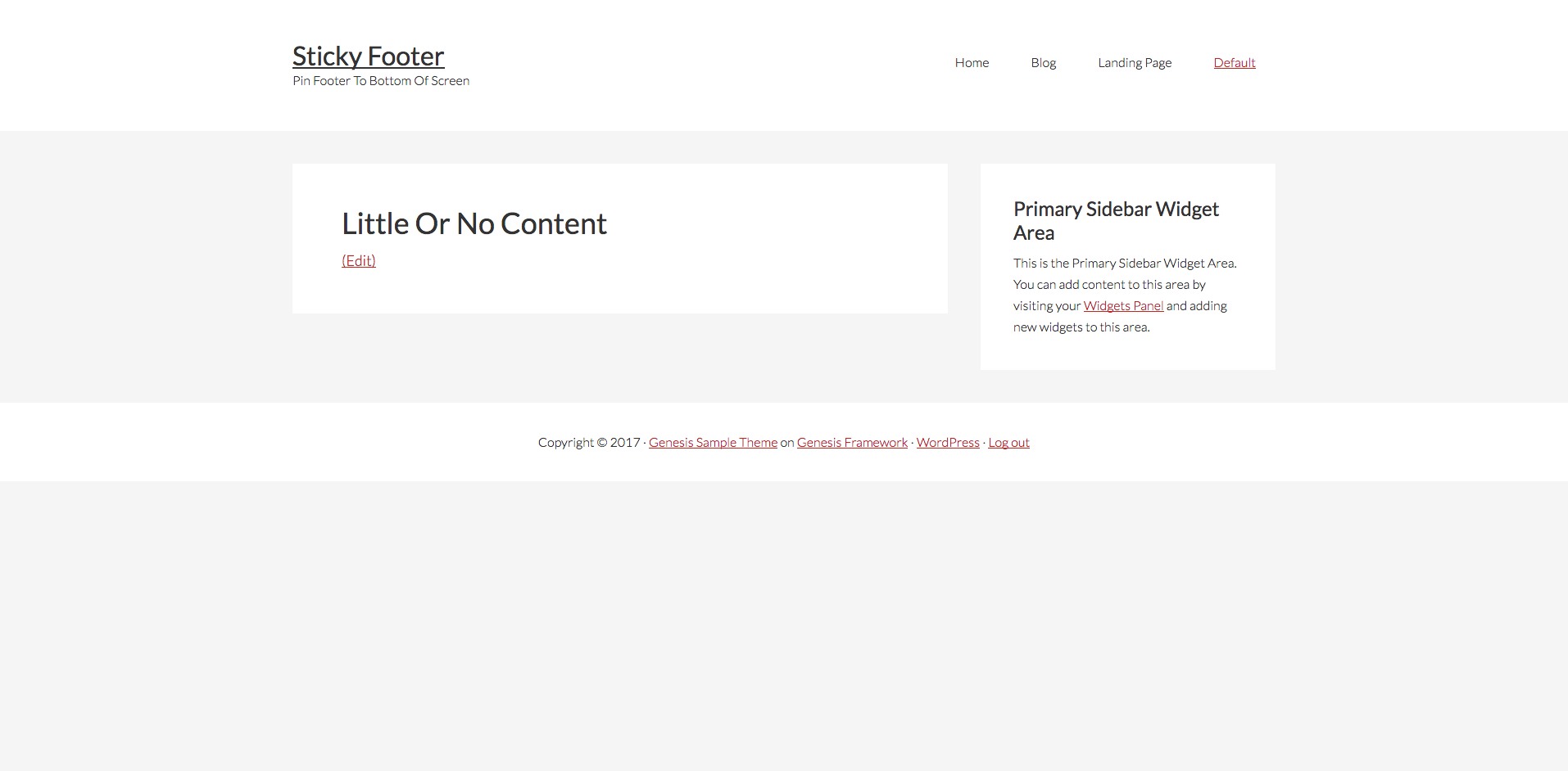
The following CSS kicks in at 800px and is tested using the Genesis Sample child theme.
Before
After

Here’s the CSS rules you can add to your style sheet.
@media only screen and (min-width: 800px) {

    .site-container {
        display: -ms-flexbox;
        display: -webkit-flex;
        display: -webkit-box;
        display: flex;
        -ms-flex-direction: column;
        -webkit-flex-direction: column;
        -webkit-box-orient: vertical;
        -webkit-box-direction: normal;
        flex-direction: column;
        height: 100vh;
     }

     .site-inner {
        -ms-flex: 1;
       -webkit-flex: 1;
       -webkit-box-flex: 1;
       flex: 1;
       width: 100%;
       padding: 20px 0;
       word-wrap: break-word;
     }

}
CSS isn’t the only way to add a sticky footer in Genesis. You can also use jQuery.
Leave a Reply
You must be logged in to post a comment.