
This code replaces the desktop header image with a smaller mobile version on smaller screens. This way your header image is not cutoff and displays clearly on hand held & mobile devices.

You can also display the content of the header right widget below your header image on or hide it on smaller screens.
Note : The solution in this tutorial will work in any version of the Metro pro child theme by StudioPress.
Demo Video
Shows the mobile image named mobile.png displaying on small screens and the desktop version on larger screens.
Image sizes for both desktop & mobile can be changed however the CSS and PHP may need modifying to match your custom sizes support for which is included for members with premium access.
Installation Steps
There’s 2 steps :
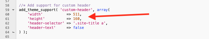
- # Modify the PHP code for the custom-header function so the values for the width and height match your desktop header image. In this case, the code is located between lines 60 – 61 in functions.php for version 2.0.1 of the Metro Pro child theme./li>
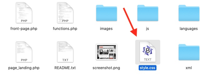
- # Copy & paste the CSS from the style.css file to the end of the Metro Pro themes style sheet and clear caching.

You can then add your desktop and mobile images using the following instructions.
Change Header Image Sizes
To change the Desktop header image, upload or replace the image using Customize – Header Image.
To change the Mobile header image, upload an image named mobile.png to the Metro Pro themes images folder.
The code in the download folder is written to work with a desktop image 511px width by 160px height and mobile image sized 270px wide by 85px in height.
Leave a Reply
You must be logged in to post a comment.