
This tutorial shows you how to modify the code in the Modern Studio Pro child theme so you can upload a larger logo than the default allows. Based on this question:
Can someone tell me step by step to uploaded and display a bigger logo to the modern studio pro theme?
In this example, we’ll change the logo size from 150px by 150px to 500px by 500px.

There’s 3 steps:
Step 1 – Modify the PHP code around line 50 in functions.php for the custom header so the width and height match your image.
//* Add support for custom header
add_theme_support( 'custom-header', array(
	'default-image'   => get_stylesheet_directory_uri() . '/images/logo.png',
	'width'           => 500,
	'height'          => 500,
	'flex-width'      => false,
	'flex-height'     => false,
	'header-selector' => '.site-title a',
	'header-text'     => false,
) );
Step 2 – Under the Site Header section in style.css starting on line 1178, modify the values for the height to match the height of your image.
/* Title Area
--------------------------------------------- */

.title-area {
	display: inline-block;
	height: 500px;
	margin-left: auto;
	margin-right: auto;
	width: 500px;
}

.site-title {
	background: #fff url(images/logo-circle.png) no-repeat;
	background-size: 500px 500px;
	float: left;
	font-family: Montserrat,sans-serif;
	font-size:clamp(14px, 0.875rem + ((1vw - 3.2px) * 0.625), 20px);
    font-weight: 400;
	height: 500px;
	letter-spacing: 1px;
	line-height: 500px;
	margin-bottom: 0;
	text-align: center;
	text-transform: uppercase;
	width: 500px;
}

.site-title a,
.site-title a:hover {
	box-sizing: border-box;
	color: #fff;
	display: inline-block;
	line-height: normal;
	max-width: 500px;
	padding: 15px 15px 20px;
	vertical-align: middle;
	word-wrap: break-word;
}

.header-image .site-title > a {
	background-color: #fff !important;
	background-position: center center !important;
	background-size: 500px 500px !important;
	float: left;
	height: 500px;
	width: 100%;
}

.site-description,
.site-title {
	margin-bottom: 0;
}

.header-image .site-title,
.site-description {
	background-image: none;
	display: block;
	height: 0;
	text-indent: -9999px;
}
Step 3 – Around line 1796 in style.css, find this CSS rule and change the value to match your image dimension :
.header-image .site-title > a {
	width: 500px;
}
Demo Video #
Shows you how to modify the PHP code and CSS to the exact same values as whats included in the above code.
Mobile Responsiveness
You may also need to add CSS for media queries if you want your logo to reduce in size on screens less than 500px width.
Center Logo Over Menu
Line 1882 contains a CSS rule you can modify to vertically align your logo over the menu like this :
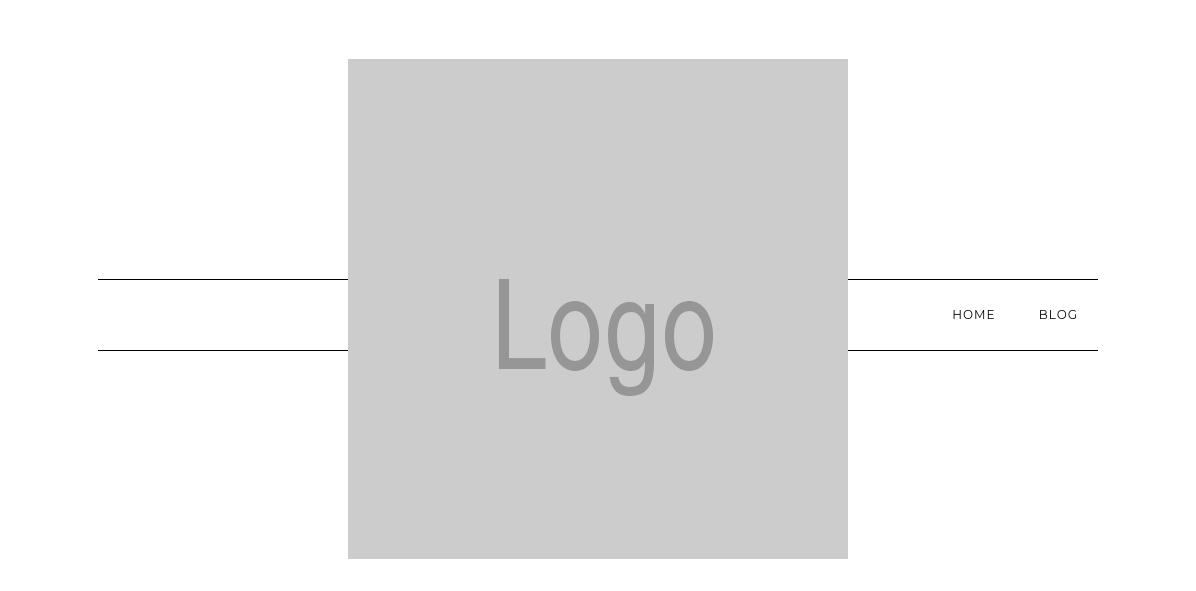
Here’s the CSS values for the margins which produce what you see in the above screenshot.
.navigation-container {
    background-color: #fff;
    border-bottom: 1px solid #000;
    border-top: 1px solid #000;
    margin-bottom: 268px;
    margin-top: -340px;
    min-height: 70px;
}
Leave a Reply
You must be logged in to post a comment.