
I was asked by a member to add a header image to the Author Pro theme by StudioPress which is why i wrote this post. ( Copy of support email below )
Rather than try and work out which CSS they modified, i simply started with a fresh download of the child theme and did the work locally.
The header image is added using the customizer meaning the PHP code for the custom_header function in the functions.php file also needs to be modified.
Basically all values in the PHP and CSS need to match the image.
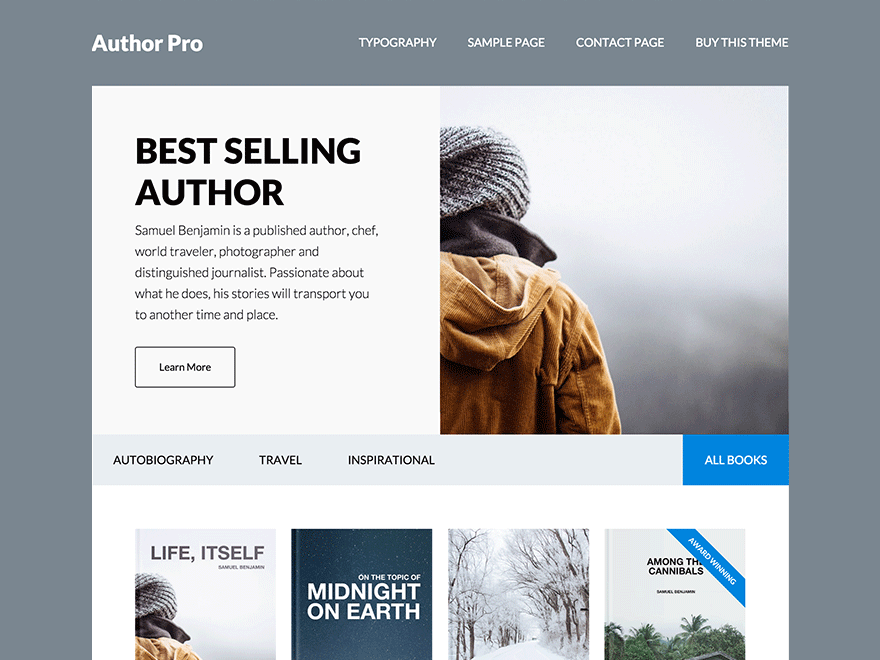
The image in this example is 375px width by 60px height.
There’s 2 steps involved.
Here’s the instructions for modifying the code:
1. PHP
1st step is to modify the values in the functions.php file for the custom_header function located on lines 62 and 63.
//* Add support for custom header
add_theme_support( 'custom-header', array(
	'flex-height'     => true,
	'width'           => 375,
	'height'          => 60,
	'header-selector' => '.site-title a',
	'header-text'     => false,
) );
2. CSS
2nd step is modify the values in your style.css file to match your image.
(a) Under the Site Header – Title Area section on line 1053 i changed the value for the width to match the width of the image to 375px.
.header-image .title-area {
	padding: 25px 0;
	width: 375px;
}
(b) On line 1065 i changed the value for the min-height to match the height of the image to 60px.
.header-image .site-title > a {
	background-size: contain !important;
	display: block;
	float: left;
	min-height: 60px;
	width: 100%;
}
Installation of Code
If you have played around with the CSS and messed things up and don’t know which code you modified, here’s 1 solution you can try.
You can remove all the CSS under the Site Header section of your child themes style.css file between lines 1004 and 1068 and replace it with the default CSS from a fresh download. Then you can start again and follow this tutorial.
Mobile Responsiveness
Based on these instructions, you shouldn’t need to modify the CSS in the Media Queries as it displays perfectly on all screen sizes.
Other Modifications
There are other modifications that needed doing like changing the background color of the site to match the background of the header image.
Support Email
Hi Brad,
I tried to increase the width of the header on Author Pro to 400px (the default height of 70px still works). Doing so made a mess of things, and all my efforts to fix it just seem to break something else.
Main problems: depending on the size of the window (either different sized browser windows or mobile devices on portrait), the nav menu either is perfectly lined up next to the header or below it, or it partially covers the top row of widgets, or it disappears altogether. Can you please help me sort this out, or point me toward a tutorial? I didn’t see one when I searched.
(If you want to solve my other problem at the same time, I’m also trying to figure out how to create space between the two top-row widgets when viewed on a mobile or in a narrow window.)
Thanks for the help! This has been driving me crazy for weeks, and I can’t seem to figure it out.
Leave a Reply
You must be logged in to post a comment.