
This tutorial provides all the CSS & CSS Media Queries for using a 500px X 250px header image in the Genesis Sample child theme by StudioPress.
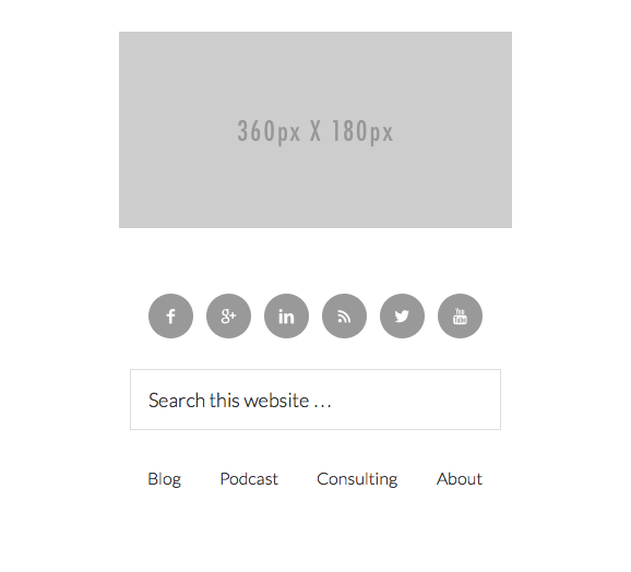
The CSS also includes Media Queries for displaying a 2nd image which is 360px X 180px on hand held devices below 500px width.
Also included is the CSS for using simple social icons, a search form and a custom menu widget, all in the header right widget area like you see in the following video:
Demo Video
Once the screen reaches 580px, a new image is displayed on the smallest hand held devices.
You simply create a image and add it to your child themes images folder using the filename logo-360.png.
Note: This solution has been developed for use with a header image which is exactly 500px wide by 250px high and also uses the header right widget area with social icons, search and menu in that order tested on the Genesis Sample child theme. Any variation may require modification of the CSS and CSS for Media Queries.
Here’s a fresh copy of the Genesis Sample child theme with all the CSS and demo images included.
Leave a Reply
You must be logged in to post a comment.