
StudioPress themes have already published a tutorial for members which includes CSS code that enables you to style your sharing buttons if using Jetpack or Slim Jetpack.
In this post, i’ll provide the CSS code which enables you to style the background & hover colors so they’re the same as each social provider uses.
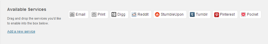
Default Button Style

Custom Button Style

All CSS code should be pasted near the end of your child themes style.css file before the start of the Media Queries if included in that file.
.content div.sharedaddy div.sd-block {
	border: none;
	margin-bottom: 10px;
	margin-bottom: 1rem;
	padding: 0;
}

.single-format-quote .content div.sharedaddy div.sd-block {
	display: none;
}

.content div.sharedaddy .sd-content {
	float: left;
	margin-bottom: 10px;
	margin-bottom: 1rem;
}

.content div.sharedaddy a.sd-button {
	border: none !important;
	box-shadow: none;
}

.content .sd-social-icon-text a.sd-button > span, a.sd-button > span {
	opacity: 1;
	padding: 8px 15px;
	padding: 0.8rem 1.5rem;
}

.content li.share-facebook a.sd-button > span,
.content li.share-google-plus-1 a.sd-button > span,
.content li.share-linkedin a.sd-button > span,
.content li.share-pinterest a.sd-button > span,
.content li.share-twitter a.sd-button > span {
	border: none;
	color: #fff;
	font-family: 'verdana', arial;
	font-size: 14px;
	font-size: 1.4rem;
	font-weight: 300;
	letter-spacing: 2px;
	letter-spacing: 0.2rem;
	text-transform: uppercase;
}

.content li.share-facebook a.sd-button > span {
background: #4965a0;
}
.content li.share-google-plus-1 a.sd-button > span {
background: #dd4b39;
}
.content li.share-linkedin a.sd-button > span {
background: #1b86bc;
}
.content li.share-twitter a.sd-button > span {
background: #00abf0;
}

.content li.share-facebook a.sd-button:hover > span,
.content li.share-google-plus-1 a.sd-button:hover > span,
.content li.share-linkedin a.sd-button:hover > span,
.content li.share-twitter a.sd-button:hover > span {
	background: #000;
}

.sd-content .sd-button span.share-count {
	color: #fff !important;
	font-size: 100% !important;
}

div.sharedaddy h3 {
font-size:clamp(14px, 0.875rem + ((1vw - 3.2px) * 0.625), 20px);!important;
font-family: 'Helvetica Neue', Helvetica, Arial, sans-serif;
text-transform: none;
letter-spacing: 0;
line-height: 1;
font-weight: bold;
}
Style More Providers
To style other social providers, simply add this code to the existing block above and change the background color to match your new providers colors:
.content li.share-add-provider-name-here a.sd-button > span {
background: #000000;
}
You also need to replace add-provider-name-here with the name of the provider. You can choose from a list of providers included in Jetpacks sharedaddy module once you install the Jetpack plugin.
Use in Other Themes
This code only works in themes using .content as the content class.
You can also use this code in other themes simply by changing all instances of .content to whatever class your themes uses for the content.
Twenty Eleven – Change from .content to #content
Twenty Twelve – Change from .content to .entry-content
Notepad++ enables you to search find and replace classes with new classes.
Note: You can reduce the size of the buttons simply by reducing the size of the font.
Leave a Reply
You must be logged in to post a comment.