
In this tutorial, you’ll learn how to easily style many different widgets WordPress includes by default in every installation.
I’ll also provide before and after images which where taken using the Genesis Sample child theme.
And i’ll also include the CSS code to style a couple of Genesis widgets individually as well.
Note: All CSS code should be copied and pasted at the end of your child themes style.css file.
Click any images to enlarge.
One Text Widget

Style the background color & text color of one specific text widget
#text-52 {
background: #699135;
color: white;
}
Style the widget title color & font size.
#text-52 .widget-title {
font-size: 2.7rem;
color: white;
}
One Category Widget
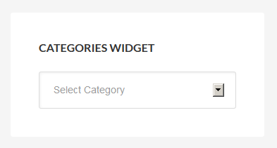
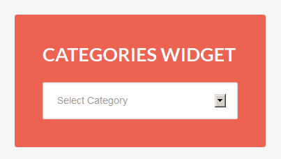
Styles the background color & text color of one category widget.
#categories-24 {
background-color: #EC6351;
color: white;
}
Style the widget title color & font size.
#categories-24 .widget-title {
font-size: 2.7rem;
color: white;
}
One Genesis User Profile Widget
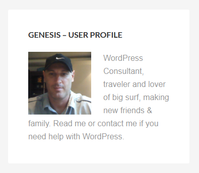

Styles the background color & text color of one Genesis user profile widget.
#user-profile-4 {
background: #EB7513;
color: white;
}
Style the widget title color & font size.
#user-profile-4 .widget-title {
font-size: 2.4rem;
color: white;
}
Makes the avatar image for this specific widget round.
#user-profile-4 .avatar {
border-radius: 50% 50% 50% 50%;
}
One Search Widget

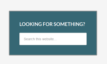
Styles the background color & adds a border to one search widget.
#search-19 {
background-color: #366774;
border: 3px solid #999;
}
Style the widget title color & font size.
#search-19 .widget-title {
font-size: 2.0rem;
color: white;
}
One eNews Subscribe Widget
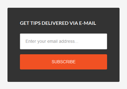
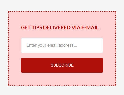
Styles the background color & text color of one Genesis eNews subscribe widget.
#enews-ext-12 {
background-color: #FFD2D4;
color: #AF100A;
border: 3px dotted #AF100A;
}
Styles the font color and size.
#enews-ext-12 .widget-title {
color: #AF100A;
font-size: 1.7rem;
}
Styles the background color or the submit button.
#enews-ext-12 input[type="submit"] {
background-color: #AF100A;
}
Styles the hover & text color of the submit button.
#enews-ext-12 input:hover[type="submit"] {
background-color: yellow;
color: #AF100A;
}
Other Examples
Some themes use the .entry-title class rather than .widget-title.
The following example changes the front-size and color of the home-top and home-bottom widgets when using the Enterprise Pro child theme:
.home-top h2.entry-title a {
   font-size: 96px;
   color: #fff;
}

.home-top h2.entry-title a:hover {
    color: #333;
}

.home-bottom h2.entry-title a {
   font-size: 19px;
   color: orange;
}

.home-bottom h2.entry-title a:hover {
    color: #333;
}
Finding The Right Widget Class
To find the right widget class to use in your child themes style sheet, simply inspect the individual widget you want to style using Firebug and look for the section i.d.
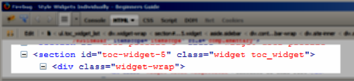
In the above screenshot, the section i.d is named toc-widget-5 for the table of contents sidebar widget.
With i.d selector classes, you always use # before the class rather than a .
In this example, you simply use:
#toc-widget-5 {
Add CSS declarations here
}
Another option is to use:
.sidebar .toc_widget {
Add CSS declarations here
}
Add Background Image To One Widget
To add a background image to any specific widget, simply upload your background to your child themes images folder.
You can then add the CSS code to style your widget.
#enews-ext-17  {
background: #333 url(images/dashed.png);
}
The above CSS code styles one eNews widget by adding both a background fallback color of #333 and an image with the file name dashed.png.
That’s the shorthand way method of writing CSS code however there is another method you could also use which requires more CSS.
#enews-ext-17  {
background-color: #333;
background-image: url('images/simple_dashed.png');
}
If for some reason your image doesn’t load, the fallback color will display so its a good idea to use a color which is as close as possible to the background color of your image.
I hope that helps you better understand how to style specific widgets individually in WordPress.
Leave a Reply
You must be logged in to post a comment.