
In this tutorial, i’ll show you the best way to add a logo and other header images to the Magazine child theme by StudioPress.
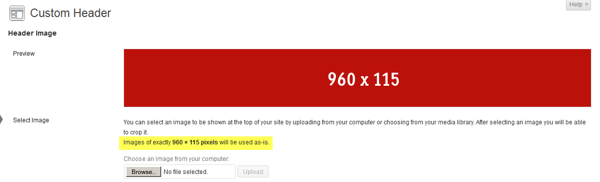
The default full width header image dimensions are 960px width by 115px height.
You can simply go to Appearance > Header and upload an image which is the exact same size:
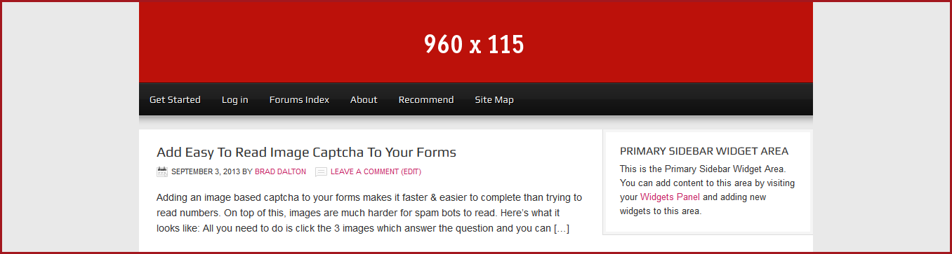
And here’s what it looks like on the front end:

Fits perfectly but the header wrap background image color needs to be changed.
Change Header Wrap Background Image or Color
By default, the Magazine theme uses an image to style the header background which you’ll find in your child themes images folder.
The size of the image is 6px width by 115px height and is named wrap.png.
If your header image is the same height, you can simply make a new image using these dimensions, the same background color as your images background and replace the default.
Here’s an example image you can use on the far right of this post ==>>
Otherwise you’ll need to change the height of the image and also modify the values for the height in both your child themes style.css and functions.php files.
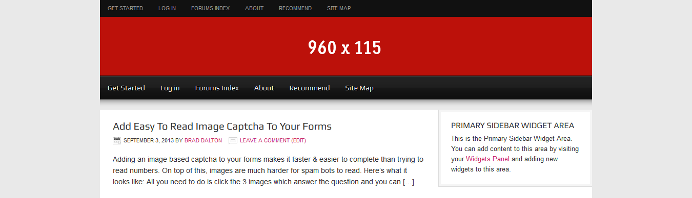
Here’s what it looks like once you’ve created a new wrap.png image and replaced the default in your images folder:

Looks perfect now but what if you don’t want a full width header?
Change Width of Header
You can change the width of your header area simply by adding a width to the CSS code on Line 163 of your child themes style.css file.
#wrap {
	background: url(images/wrap.png) repeat-x;
	margin: 0 auto;
}
Copy the above block of code and paste it at the end of the file then add the width which is 960px by default.
#wrap {
	background: url(images/wrap.png) repeat-x;
	margin: 0 auto;
        width: 960px;
}
Here’s what it looks like now after changing the width of the wrap to the same as the header:
Now your header area and secondary nav menu are 960px width rather than full width.
But how about the primary nav menu?
To change the background width of the primary nav menu, you can simply copy the CSS code from Line 352 of your child themes style.css file and paste it at the end of the file where you’ll need to add 3 new declarations:
Change this:
#nav {
	background-color: #111;
	clear: both;
	overflow: hidden;
To this:
#nav {
	background-color: #111;
	clear: both;
	overflow: hidden;
	width: 960px;
	display: table;
        margin: 0 auto;
}
And here’s the result:
Lets now look at adding header images which aren’t the default height or width.
Change Header Image Width & Height
If your logo or header image is taller than the 115px default height, you’ll need to change the values for the height in both your functions.php and style.css file:
On Line 43 of your child themes functions.php file, change the value for the height from 115px to 200px:
From this:
/** Add support for custom header */
add_theme_support( 'genesis-custom-header', array(
	'width' => 960,
	'height' => 115
) );
To this:
/** Add support for custom header */
add_theme_support( 'genesis-custom-header', array(
'width' => 960,
'height' => 200
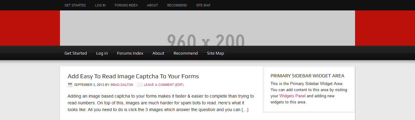
) );Now go to Appearance > Header and you’ll see the changes to the height value under the image have changed from 115 to 200 Pixels:

Here is what it looks like now on the front end:
Changing the PHP code has enabled you to upload an image which is 200px in height without forcing your to crop the image but it hasn’t changed the actual height of the header area.
To do this, simply copy the CSS code from Line 176 of your child themes style.css file to the end of the file and change the value from 115px to 200px:
Change from this:
#header {
	min-height: 115px;
	margin: 0 auto;
	overflow: hidden;
	width: 960px;
}
To this:
#header {
	min-height: 200px;
	margin: 0 auto;
	overflow: hidden;
	width: 960px;
}
And this is what it looks like on the front end:
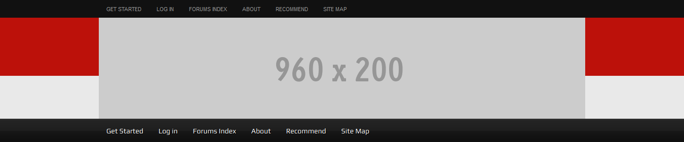
All you need to do now is replace the wrap.png image in your child themes images folder with an image which is 6px x 200px in height.
And here is what it looks like now:

Clearly, if you’ve reduced the wrap width to 960px like we did in a previous step, you won’t need to add the new wrap image.
You might also like to make the new wrap background image the same color as your header image which you can do using a graphics design tool like Paint.net for Windows or GIMP for Mac users.
Add Header Right Widget Image
The default width for the header right widget is 468px width.
If you add your image HTML to a text widget in the header right area, this is what it will look like if the image is 468px:
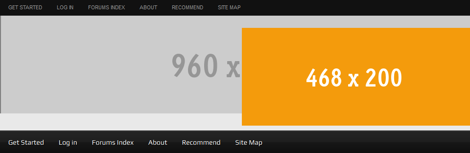
This clearly needs fixing. You’ll need to change the width of your logo or full width header and also modify the padding for your widget image.
To fix this, simply go to line 215 and remove the padding:
Change the CSS code from this:
#header .widget-area {
	float: right;
        padding: 25px 0 0;
	width: 468px;
}
To this:
#header .widget-area {
	float: right;
	width: 468px;
}
And this is how it looks now:

Looks better but there’s still a gap below the header which needs fixing. Lets come back to that after adding the logo image to the left of the header.
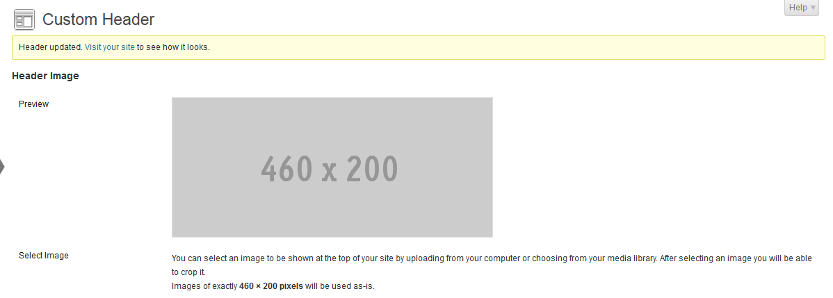
Finally, we can change the value for the width in the PHP code and reduce the width of the custom header image under Appearance > Header:
On Line 45 of your child themes functions.php file, change the value for the width to around 460:
/** Add support for custom header */
add_theme_support( 'genesis-custom-header', array(
'width' => 460,
'height' => 200
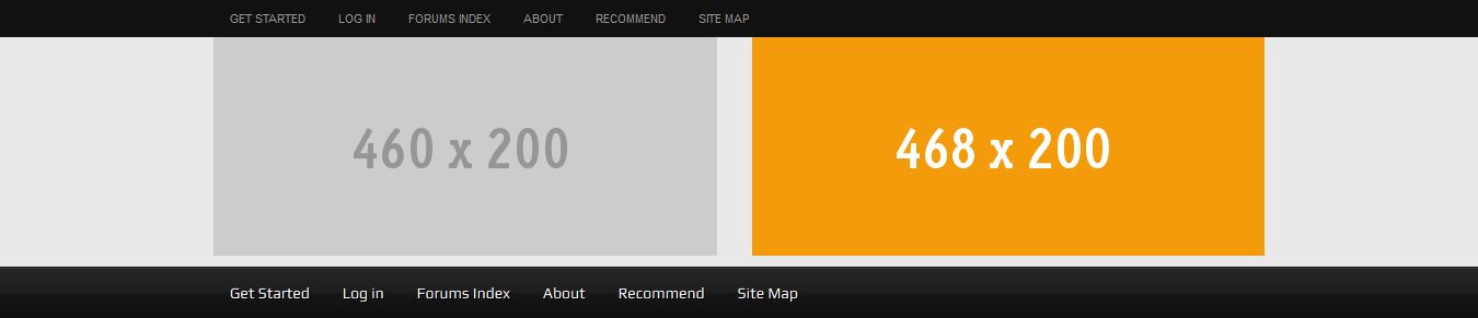
) );Now we can go to Appearance > Header and upload an image this size:
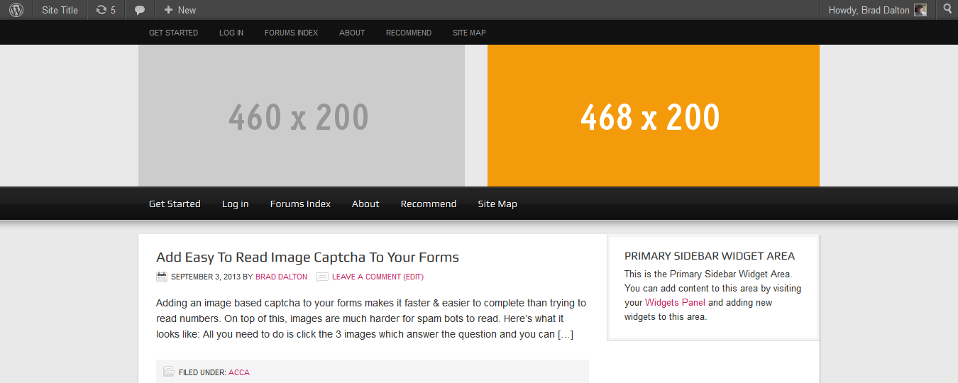
And here’s what it looks like on the front end:
The small gap below the header still needs fixing, so how do we do that?
Because i added HTML code for an image to the text widget in the header right area, the theme adds a margin of 10px because the image is centered as you can see from the CSS code below.
To fix this so it only applies to an image in that area, go to Line 1155 and copy the code to the end of your child themes style.css file:
And change this”
img.centered, .aligncenter {
    display: block;
    margin: 0 auto 10px;
}
To this:
#header .right-widget img.centered, .aligncenter {
    display: block;
    margin: 0 auto 0px;
}
So there you have it. Here’s the final result:
Conclusion
There’s a lot more you can do with header images like increase the width of the right widget area and add different sized logos etc.
I hope this gives you a better understanding of how to use different sized header images when using the Magazine child theme by StudioPress.
Leave a Reply
You must be logged in to post a comment.