
The solution in this download folder enables you to add a logo of any size and vertically align it with your nav menu like this :

This vertically aligns all site header elements including your site title or custom logo, nav menu and the responsive menu toggle which kicks in when your screen width hits 960px if using the Genesis Sample theme.
Demo Video
Shows the custom logo and menu vertically aligned on both desktops and mobile screens.
Tested using the Genesis Sample child theme by StudioPress.
Installation Steps
There’s 2 steps :
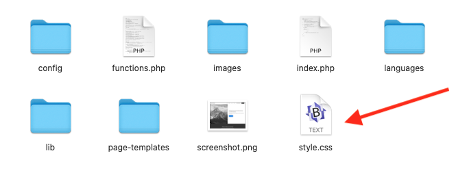
- # Copy & paste the CSS from the style.css file to the end of your child themes style sheet and clear all types of caching.
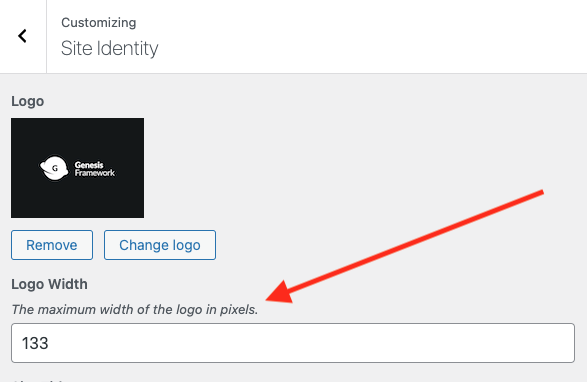
- # Go to Customize > Site Identity and set the width of your logo. In this case, the logo is 100px in height by 133px in width.
Note : You will need to modify the value for the following CSS media query if your logo is not 100px in height to vertically align the menu toggle icon on mobile screens.
@media only screen and (max-width: 960px) {

.menu-toggle {
     margin-top: 30px;
}

}
Leave a Reply
You must be logged in to post a comment.