
The first draft for this years default theme for WordPress, Twenty Thirteen is looking pretty special already!
Mark Jaquith posted a brief introduction to 2013 this week and included a link to demo twenty thirteen.
You can also download the theme and test it out on a demo site or local installation if you’re interested in taking a closer look.
The new theme which is due for release later this year is a bit like the Genesis child theme pretty pictures as it uses post formats and a full width layout by default.
Don’t worry though, there’s a primary sidebar included if you feel the need.
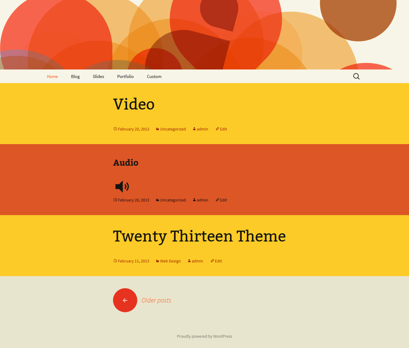
The Home Page
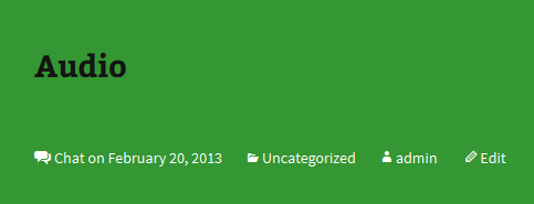
The home page is a bit like what Code for the People have done with different colored post formats which can be easily customized by changing the background, font size, and font style.
/* Chat */
.format-chat {
background-color: #eadaa6;
}
Color is a very personal choice and i know many users will want to customize the home page, blog page and different colors for each post format selected.
Header Images
You’ll get a choice of 3 default header images to display which are fixed width.
♦ Diamond
 ◊ Star

ο Circle

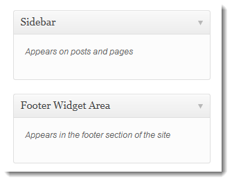
Widgets
Not a lot to report here as there’s only the 2 default widget areas.
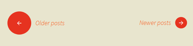
Page Navigation
Pretty cool looking pagination as you can see here.
Mobile Responsiveness and Cross Browser CSS
Cross browser consistency is assured and images for posts, comments, and widgets are responsive.
There’s a heap of CSS code in the style sheet for mobile responsiveness and cross browser usage.
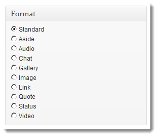
Post Formats
Large selection of posts formats to choose from.
Search Box
Nice little expandable search box is included which i wish could be connected to Google custom search for higher accuracy!.
![]()
Still trying to work that one out and will write a step by step tutorial once i can get my head around it.
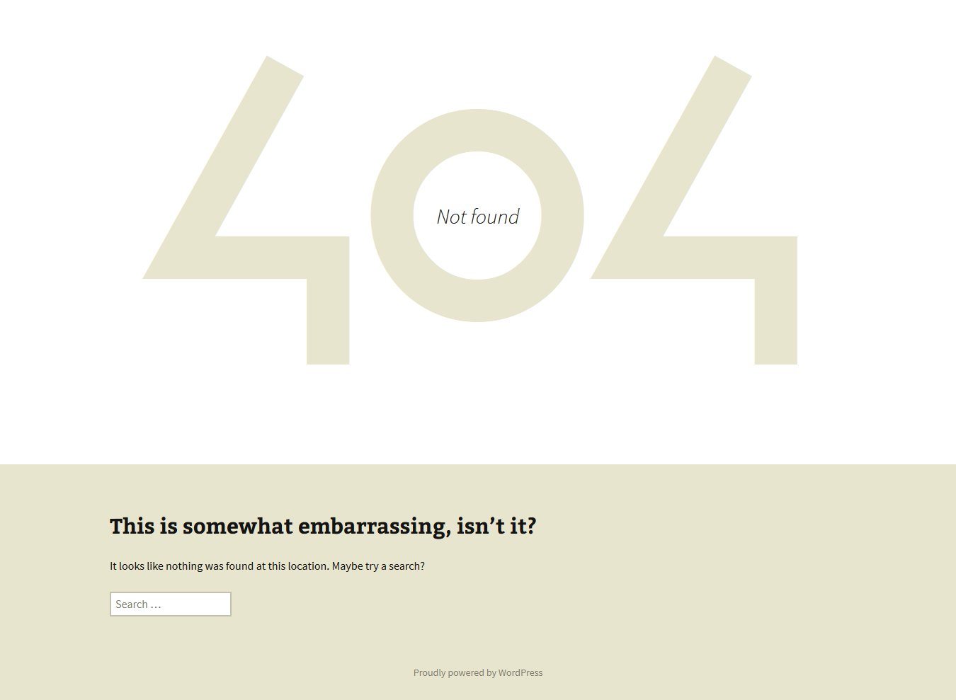
404 page Is Very Cool!
What do you think of this 404 page?
It just may keep a few readers from leaving because it looks so cool compared to what error pages generally look like.
Search form at the bottom could be moved above the image don’t you think?
Using 2103
This theme, like WordPress, is licensed under the GPL so you can pretty much go for it!
Use it to make something cool, have fun, and share what you’ve learned with others.
Tags: black, brown, orange, tan, white, light, one-column, two-columns, right-sidebar, flexible-width, custom-header, custom-menu, editor-style, featured-images, microformats, post-formats, rtl-language-support, sticky-post, translation-ready.
Leave a Reply
You must be logged in to post a comment.