
In this tutorial, i’ll provide several different methods which enable you to display any type of posts archive in columns.
You can use the CSS rules in any theme however you may need to modify it slightly.
CSS Grid
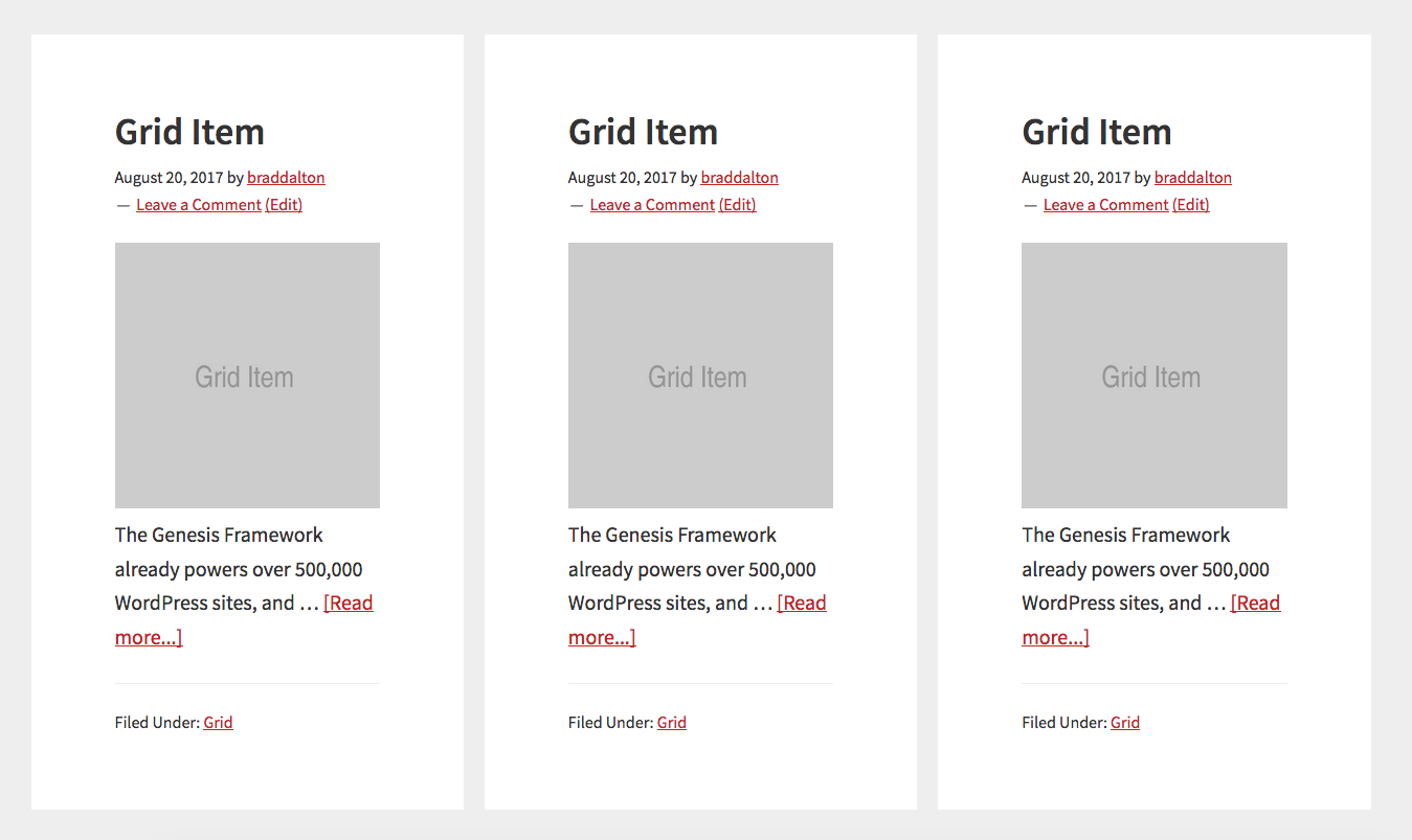
CSS Grid enables you to use percentages, pixel values or fractional units fr like you see in the following CSS rule.
.content {
    display: grid;
    grid-template-columns: 1fr 1fr 1fr;
    grid-gap: 20px;
}
The above CSS generates exactly what you see in the following screenshot.
The above CSS rule can also be written using the repeat() CSS function like this :
.content {
    display: grid;
    grid-template-columns: repeat(3, 1fr);
    grid-gap: 20px;
}
You can also write the CSS using percentages like this :
.content {
    display: grid;
    grid-template-columns: 33% 33% 33%;
    grid-gap: 20px;
}
And, you could also uses pixel values.
Media Queries
You can use the following CSS rule which displays each post ( grid item or fractional unit ) in 1 column on smaller screens
@media only screen and (max-width: 960px) {

.content {
        grid-template-columns: 1fr;
        grid-gap: 0;
    }

}
Other Methods
The following methods control the width of the .post class. You can also use these CSS rules with the .entry class or filter the post class and add your own custom class.
Here’s an example showing a category archive page displaying 3 columns of featured images using the content sidebar layout in Genesis.

Here’s the code which makes the above happen:
.archive .post {
     display: inline-block;
     width: 33.333333333333%;
     padding: 1%;
}

.archive .entry-meta,
.archive .entry-title,
.archive .entry-header:after,
.archive .entry-content p {
    display: none;
}.archive class.Some themes will need the padding and some will not so you can remove it in this case.
Here’s what the Columns look like using the full width template for the Twenty Fourteen default theme for WordPress.

Here’s the CSS code:
.archive .post {
     display: inline-block;
     width: 28%;
     padding: 2%;

}

.archive .entry-meta,
.archive .comments-link,
.archive .entry-content p {
    display: none;
}

.archive .entry-title {
    font-size: 25px;
}
Here’s the result of using the CSS code below and full width layout option on the News Pro theme by StudioPress:

And here’s the code you’ll need to add to your child themes style.css file before the start of the Media Queries.
.archive .post {
display:inline-block;
width:33.333333333333%;
}
.archive .entry-meta,
.archive .entry-title,
.archive .entry-header:after,
.archive .entry-content p {
display: none;
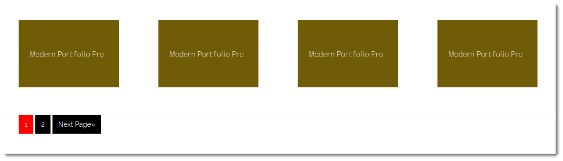
}4 Column Grid
Here’s another way to create archive page columns for your featured images using a different CSS method.
.archive .post {
    float: left;
    width: 25%;
}

.archive .post:nth-of-type(4n+1) {
    clear: left;
}

.archive .entry-meta,
.archive .entry-title,
.archive .entry-content p {
    display: none;
}
And here’s the result tested on Genesis:
Different Themes – Code Variations
Clearly, different themes are coded different with different values for different classes.
You’ll notice in the Twenty Fourteen themes CSS that i have added a value to change the entry title. You will need to customize this value as all titles are different lengths which may mess up the display. Or you can simply hide the titles altogether in most themes.
The CSS will also be different on some themes depending of whether you use the full width layout or content sidebar layout so you will need to modify the code based on which theme you’re using.
Media Queries are not included in this tutorial.


Leave a Reply