Change Logo & Header Image Sizes In Genesis

All StudioPress child themes are different yet many use the same functions and CSS code. The only difference in many of the themes when it relates to header images and site title area’s are the values.

When it comes to adding a logo or header image, you may need to modify the code to get it looking perfect.

In this tutorial, i’ll show you which code needs to be changed so your logo image and header right widget displays your images perfectly.

We’ll go from this simple text header:

default header

To this:

new header logo

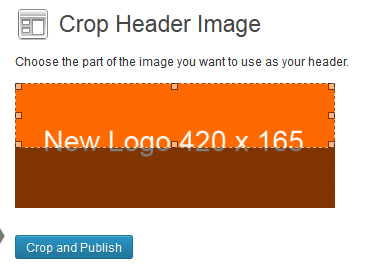
The new logo size for this demo will be 420 width by 165px height replacing the default which was 320 x 65.

New Logo Size

I’ll be using the new Eleven40 Pro theme for this tutorial as the previous version required a fair amount of code editing if you wanted to add your own logo or change the header image sizes.

The new version makes the job so much easier in line with with many other themes StudioPress have released.

There’s 6 small code blocks which need to be modified in your child themes files.

5 of these code blocks are CSS in your style.css file and the other is PHP in your functions.php file.

If you go to Appearance > Header in your WordPress dashboard, you’ll see these values for the custom header: 320 x 65 pixels.

custom header size

To change these values, you’ll need to open your child themes functions.php file using a text editor like Notepad++.

Line 37 & 38 in your functions file:

Change the width and height values in this code from these:

//* Add support for custom header
add_theme_support( 'custom-header', array(
    'width'         => 320,
    'height'        => 65,
    'header-selector'   => '.site-header .title-area',
    'header-text'       => false
) );

To these values:

//* Add support for custom header
add_theme_support( 'custom-header', array(
    'width'         => 420,
    'height'        => 165,
    'header-selector'   => '.site-header .title-area',
    'header-text'       => false
) );

If you don’t and simply upload your 420 x 165 image, this is what you’ll get:

crop and publish larger image

Your image will be cropped and not display the full size in your header.

Once you add an image to your header right widget using the maximum size of 800px for the width, this is what it will look like:

change title area width

To fix this, you’ll also need to modify the values in your style.css file.

On line 872, change the height from 65px to 165px like this:

.site-header {
    background: url(images/texture.png);
    min-height: 65px;
    position: fixed;
    width: 100%;
    z-index: 999;
}

To this:

.site-header {
    background: url(images/texture.png);
    min-height: 165px;
    position: fixed;
    width: 100%;
    z-index: 999;
}

At this point, you could also change the background image for the header or remove it Fro the code and change it to a color like white.

Note: Do not remove the texture image from your images file as its used for styling other elements of your site

Here’s what your header image for your logo looks like now with an image in the header right widget area which is 800px width by default.

header eleven40 pro - Change Site Headr Height

To fix this, change the values on line 887 for the width of the title area from this:

.title-area {
    float: left;
    width: 320px;
}

To this:

.title-area {
    float: left;
    width: 420px;
}

Now this won’t fix the problem completely until you reduce the width of the header right widget by 100px.

change title area width

On line 957, change the width from this:

.site-header .widget-area {
    color: #fff;
    float: right;
    text-align: right;
    width: 800px;
}

To this:

.site-header .widget-area {
    color: #fff;
    float: right;
    text-align: right;
    width: 700px;
}

Now that doesn’t fix the problem completely either because the height for the header image in the site title is still using the old values and therefore cut off.

image height to small

To fix this, go to line 945 and change the height value from this:

.header-image .site-title a {
    float: left;
    min-height: 65px;
    width: 100%;
}

To this:

.header-image .site-title a {
    float: left;
    min-height: 165px;
    width: 100%;
}

Now the full height of your new logo image will display inline with the new width for your header right widget image.

change site-header widget-area

You could also now change the image in the header right widget so its the same height as your logo.

Bring Logo & Header Right Widget Image Inline

Once you add a new image size to your header right widget, you’ll find its not flush with the top of your logo:

header images messed up

To fix this, simply add some CSS for a margin to the block of code on line 940.

.header-image .title-area {
    margin-top: 12px;
    margin-top: 1.2rem;
}

This is now what your header looks like which can be styled further without much effort.

new header image sizes

Change Header Background Color

In the above 2 screenshots, i’ve changed the headers background.

To do this, simply remove the image url from line 871 and add a color instead to remove the black background and make it white.

.site-header {
    background: white;
    min-height: 165px;
    position: fixed;
    width: 100%;
    z-index: 999;
}

Don’t forget, once you change the header background color to white, your text color will need to change from white to a dark color otherwise it will be invisible.

Try adding something like this at the end of your style sheet:

.site-header .widget-area .genesis-nav-menu a {
color: #333;
}
Note: Out of the box, the Eleven40 Pro theme uses a fixed position for the header which you can remove simply by removing the position: fixed code from the above block of CSS.

That’s it for today’s tutorial about how to change the images sizes for your logo in the site title area and your header right widget.

The method used in this post can be applied to many of the StudioPress themes.

Related Tutorials


Comments

96 responses to “Change Logo & Header Image Sizes In Genesis”

  1. Hi Brad
    I have changed the header logo size, but I am now looking for a way to use 2 different Logo sizes, depending on the header size.
    If you look at my site http://www.capitalblokartclub.org.nz and when you scroll down the header reduces in size and the logo does not resize well. I am thinking I need to have a smaller logo showing instead of the standard one re-sizing.

    1. Brad Dalton Avatar
      Brad Dalton

      This requires a fair amount of custom coding and not something i have published already so its not covered under membership however you can ask for a quote.

  2. […] this post Titled Change Logo & Header Image Sizes In Genesis where i used the new Eleven40 Pro theme as an […]

  3. Thanks so much I am using Agency Pro theme and I tried many sites to get a solution for this and yours was the only one which worked AND the easiest to follow.

    The line numbers in the stye sheet were a little different but because you showed what code to replace I was easily able to locate and replace..and I don’t know PHP just basic HTML I’m a real noob so THANKS AGAIN

  4. Thanks for this post Brad,

    Instructions worked perfectly for the Steamline pro theme.

  5. Hi Brad . . .

    Thanks for the nice tutorial.

    I wanted to add a text image to the header, instead of just using text only. It displays just fine, except for two things:

    When I exit full-screen mode on my Mac and reduce the screen size by sliding my cursor, there’s a point where the site title’s image gets cut off. If I make it a bit smaller, the navigation links disappear instead of a drop-down menu displaying under the site title.

    I’m not sure what I did to make this happen and would sure welcome some feedback.

    On mobile devices, the drop-down link doesn’t appear either.

    Thank you.

    1. Brad Dalton Avatar
      Brad Dalton

      Hello Carla

      You will need to add CSS to the Media Queries section at different screen sizes.

      The values of the CSS will vary depending on your image size and how you want it to look at different screen sizes.

      1. Oh, good to know. Thank you.

        I really have no understanding of how media queries work. I thought eleven40 Pro had responsiveness covered for me.

        In the banner on the site I just launched, I set a background image, which is not reducing in size. The elements on top (the book cover images and the author photo) just slide around. The author photo does reduce in size for some reason, but not the book images.

        And nothing is retaining any of the formatting I see when in full-screen mode on my computer.

        Ugh.

        Carla

        1. Thanks for giving me some direction on this. It’s definitely a media query learning curve. I’m glad to finally learn how this works.

          :o)

  6. Hey Brad,

    I followed your tutorial a few weeks ago and spread the length to 420, leaving the height the same as I did not need the height changed. Looking today, for the first time in a few weeks, visually it has reverted back to a 2-line header. I have checked the functions and style files and they are still set to 420, but not showing now. Any ideas? Unrelated, I also made a change to removing the borders on gallery images, and those have returned too with the changes still in showing in the .css.

    Thank you in advance…

    George

    1. Brad Dalton Avatar
      Brad Dalton

      Looks like its your browser cache or maybe plugin or server side caching.

  7. Lindsay Collins Avatar
    Lindsay Collins

    Hey Brad, I’m pulling my hair out. I’ve done this before and put a new logo on my webpage but I had a new one designed. Now even though I replaced the image with the new logo in file manager and changed the path in my editor, my logo won’t show. The weird thing is if I go to Appearence>Customize the logo shows, but when viewing my site normally the logo doesn’t show. I am using the Jane Theme. Any help would be awesome.

  8. Jacqueline Avatar

    Hi there,

    Great tutorial. I followed it for the site I am currently configuring. The header size I want is 1011 x 300. For whatever reason, I can’t get the header to display all 300px., Seems like the max that I can get to display correctly is 624 x 185. Ideas?

    1. Brad Dalton Avatar
      Brad Dalton

      Looks fine to me Jacqueline. Try clearing any browser, plugin or server side caching.

      1. Jacqueline Avatar

        Hey, look at that! I swear, it did NOT look like that when I first did it. Promise. The site must have known that I actually reached out for help.

        1. Brad Dalton Avatar
          Brad Dalton

          Those browsers are not nice sometimes.

  9. Hi Brad,

    I tested this code again, but this making sure I had the path correct and it work.

    background: url(‘images/texture.png’);

    I will keep a keen eye out for the path issues in the future.

    Regards.

  10. Hi Brad,

    I could easily change the site header background in eleven40 pro version 2.0. This is the default code for ver 2.0
    [code]
    .site-header {
    background: url(texture.png);
    left: 0;
    min-height: 65px;
    position: fixed;
    top: 0;
    width: 100%;
    z-index: 999;
    }

    This is the default code for ver 2.2.1

    .site-header {
    background-color: #000;
    left: 0;
    min-height: 65px;
    position: fixed;
    top: 0;
    width: 100%;
    z-index: 999;
    }
    [/code]
    I tried adding this line –

    background: url(texture.png);

    To ver 2.2.1 and it does not work. The site header section became blank instead.

    Can you say what I am doing incorrectly?

    Thanks.

    1. Brad Dalton Avatar
      Brad Dalton

      Where did you put the image?

      If its in the images folder, use this:

      [code]
      background-image: url(‘images/texture.png’);
      [/code]

      1. Hi Brad,

        Yes, it is located in the images folder. Your code work perfectly 🙂

        I truly thank you!

        I have to say that I did researched this before finding your website and sought your help.

        I had tried this:

        background-image: url(‘texture.png’);

        But now realize that I had the image path incomplete.

        Again, thank you.

        Ps. In the same eleven40 pro, do you have any code that I can use to position the site title to the absolute left?

        1. Brad Dalton Avatar
          Brad Dalton

          I would need to check your code and test it first.

          Please use the contact form on my site if you want me to do this for you.

          1. Hi Brad,

            I am continuing my research on the last request. I may get some help on this.

            If that does not work out, I will contact you for further assistance.

            Regards.

            Donovan

  11. Bartley Avatar

    Does this also apply for the Centric Pro mobile version theme?

    I added a new header image with the exact suggested dimensions (360×80) and the desktop version looks fine, but the mobile version has a bit of a hiccup.

    The header image is partially overlapping the large heading text on the home page. It looks like there’s extra padding with image vs none at all with the default site title header.

    How do I adjust the padding myself?

    1. Brad Dalton Avatar
      Brad Dalton

      All themes are coded differently.

      You may need to modify the CSS in the Media Queries.

  12. Rick Dawson Avatar
    Rick Dawson

    Hi Brad,
    I followed the tutorial here – excellent work! – when I changed my wife’s blog/site over to Genesis Eleven40 Pro site and found it painless. My only problem is that the title of the first post (and the meta info directly under that) appears to be hidden under the newly increased size of the header. Any thoughts on what I need to change to bring it back visible on the home page?

    The url is http://www.marchforthdaily.org and thanks!

  13. Thanks this was exactly what I was looking for.

    1. I had the same issue. Ever find a correction?

      I did modify the width per the tutorial, but had to change the height back from covering the top of the primary and secondary sidebars.

      Thanks in advance. Great tutorial.

      1. Brad Dalton Avatar
        Brad Dalton

        I would need to see all the code and test it which is not something i can offer i’m sorry.

        What i do is test everything as i’m writing the tutorials and take screenshots of the results.

        There’s many variables which come into play.

        Thanks for the feedback George.

  14. Thanks, that was a great help. It was the changes needed to CSS that were throwing me (using the new Generate Pro theme).

  15. Kevin Avatar

    Thanks for the post, Brad! Very helpful!

  16. Hi, what if I wanted to remove the place holder for the default logo so my menu would center itself without dropping down and making the menu bar bigger. ( think its the reason)

    My menu isn’t centered with css anyway and it dropped to bottom of the grey bar instead of being in center.

    thanks ive enjoyed reading your posts, they have helped in my eleven40 build

    1. Brad Dalton Avatar
      Brad Dalton

      Looks like its centered to me Greg.

  17. this site is such a great resource, thanks for all the helpful hints!

    im using minimum pro and was able to follow along with your tutorial pretty well. curious to know how i can modify *only* the homepage to have a larger logo? the other pages on my site would be fine with the default sizing.

    thanks for any advice!
    emily

      1. one of those snippets did the trick—thanks!!

  18. Hi Brad I’ve followed this tutorial except i don’t want to change the width just the height from 65px to 85px. Seemed simple enough except I can’t find how to change the height of the right footer widget, so it still seems 65px high even through I’ve gone through my style sheet and can’t find any reference to 65px, though when i look in firebug i can see the nav primary area is 678px x 65px but i can’t see where to change that 65px.

    So my right hand menu is still 65px and not aligned centrally with the height of the menu.

  19. Hey Brad, no worries I got it sorted. (Also realized I forgot to give you the link to look at it)

    Anyway, just FYI, the media quires for eleven forty styling the iPad (Landscape) has the following style…

    [code]
    .content,
    .site-header .widget-area {
    width: 630px;

    }
    [/code]

    I reduced it to 550px and it’s back to normal…

    Thanks for all the info on your site Brad…good stuff!

  20. Hey Brad, great tutorial!

    I just completed it and everything worked perfectly with one exception.

    On the iPad (in landscape mode) this has pushed the navigation menu down as if the title area was 100% wide.

    I added borders to both the title area and header right widget area to see if the widths were overlapping but they weren’t.

    Any Idea’s.

    I know your time is valuable but any help would be greatly appreciated.

  21. Thank you so much! 🙂

  22. HI Brad,

    dont worry! I got it sorted. I removed the fixed position and it worked 🙂

    Thanks
    Nick

  23. Hi Brad,

    Thanks for an amazing post! I am having a little trouble though. The increase in the header is not blocking the first few lines of text on my homepage. You can check this out on: http://www.cloudcrmexperts.com.au. Do you have any suggestions on how to fix?
    Thanks
    Nick

  24. Hi Brad,

    I am facing a very strange issue. I followed your advice and replaced the logo.png with mine. It works perfectly on desktop, however, when I open my site from mobile (Android, Chrome browser), it displays the default Genesis framework logo, instead of mine. I am not sure why this is happening. It would be great if you can take a look at my site (you can know my domain from email address). Thanks.

    1. Brad Dalton Avatar
      Brad Dalton

      Yeah, it is strange. Sometimes the favicon or logo can be cached so it can take several days for your own to display.

  25. One more update. I Just went back and followed the directions and changed the dimensions to match what you have listed above. I’m still getting a large amount of white space located below the the header image. Any thoughts?

    Thanks

    1. Brad Dalton Avatar
      Brad Dalton

      Hello Patrick

      The changes you have made are nothing like whats in this tutorial.

      This tutorial removes the black background and adds a logo as well as an image in the header right widget area so they align.

      The screenshots show you the result which i took after changing the code which i have included in this post.

      This means that the code changes only produce the result shown in the screenshots and don’t cover all solutions.

  26. I could use some help. I followed the directions and changed my header image to be 750×190. I also modified the header widget area and reduced the size appropriately. I’m getting a large chunk of “white space” between my header image and the main nav bar. Can anyone tell me what I”m missing? Here is the link to the site.

    Thanks
    Patrick

    1. Brad Dalton Avatar
      Brad Dalton

      Here’s what i found in your child themes style sheet:
      [code]
      .site-header {
      background: url(images/texture.png);
      min-height: 65px;
      position: ;
      width: 100%;
      z-index: 999;
      }

      .title-area {
      float: left;
      width: 320px;
      }

      .site-header .widget-area {
      color: #fff;
      float: right;
      text-align: right;
      width: 800px;
      }
      [/code]

      A widget area of 800px width won’t work with a header image of 750px width which i can’t see on your site either.

      Please clarify exactly what you want.

  27. Hi Brad, This has to be one of the most description blogs for CSS, love it and Thank you!

    I am finding it impossible to center my site-title. It is currently on the left and I would like it to be in the center. I seem to have tried absolutely everything, but nothing has worked. Would greatly appreciate your insight!

    Thanks Again!!!

  28. Kimberly Avatar

    I actually figured out the responsive issue. I had to change this from 320 to 1120:
    [code]
    @media only screen and (max-width: 1120px) {

    .header-image .site-header .title-area {
    background-size: contain !important;
    }
    [/code]
    I also adjusted the Nav bar to be full screen and that took care of the extra white space for some reason. Thanks!

    1. Brad Dalton Avatar
      Brad Dalton

      Good stuff Kimberly. Not hard to customize the media queries when using StudioPress child themes

  29. Kimberly Avatar

    Great tutorial, and very simple to follow for a newbie like me! I used it but made a full size header by making the logo width area 1120 and the right widget area 0. Is that the best and correct way to do it?

    Now my header is not responsive though, but the rest of the site still seems fine. Is there a way to make it responsive again?

    Also, there is a lot of space between my header and the nav bar, even though I made my header the exact size. Thoughts on that?

    1. Brad Dalton Avatar
      Brad Dalton

      Hello Kimberly

      Looks like you figured it out.

  30. Brad,

    This is awesome information and I love the step by step.

    How can I modify this to have the image above the header right widget instead of to the left of it?

    I am thinking that if the width of the image is the same as header right widget, the header right widget will automatically appear under the widget. what do you think?

    Thanks,
    Heidi

    1. Brad Dalton Avatar
      Brad Dalton

      Hello Heidi

      Yes. You could change the widths for the header elements to zero and the header right widget to 100% and hook in the image above the widget by using a higher priority for the 3rd parameter in the function.

      Sure there’s other ways to do it but wouldn’t be difficult.

      What theme are you using?

      1. Heidi Bender Avatar
        Heidi Bender

        I am using theme Eleven40 Pro. In hindsight, I probably should have chosen a theme that had a picture at the top. this is my first time to use WordPress and am figuring things out as I go.

        I am not sure I understand the instructions in your reply, but I will give your step by step a try.

        Thanks again,
        Heidi

        1. Brad Dalton Avatar
          Brad Dalton

          Yes its a bit of CSS coding involved in the Header section of your child themes style.css file that needs to be modified.

          1. Heidi Bender Avatar
            Heidi Bender

            I almost have it figured it. I got the new image in place with the menu below it. but now there is a gap between the menu and the next element on the page (site description).

        2. Heidi Bender Avatar
          Heidi Bender

          Brad,

          I got it all figured out!

          I am very thankful for this tutorial!!!

          Heidi

          1. Brad Dalton Avatar
            Brad Dalton

            Glad to hear it Heidi

  31. Bro a ton of thank you,i can’t explain the value of this tutorial for a beginner like me and many others!!!

    1. Brad Dalton Avatar
      Brad Dalton

      Happy to help Alan

  32. Do you know if this works for the Amped Child Theme ?

    I am trying to get a background image the length of the Nav Bar menu

    http://www.teammillerbball.org

    Thanks

    1. Brad Dalton Avatar
      Brad Dalton

      I just looked in the files and see an image for the logo.png

      If you want a full width header image, you will need to change the values in the CSS code.

      Add this code to the end of your child themes style.css file:
      [code]
      .header-image #header #title-area {
      background: url(images/logo.png) left top no-repeat;
      width: 960px;
      height: 100px;
      }
      [/code]

      Then replace the default logo.png file in the images folder with the new one which matches the same dimensions as the values in the code above.

  33. I was using Eleven40 before and I upgraded to e40 Pro yesterday. There is no after post widget and I am having difficulty putting my social share icons after post. Also I do not like the tagline showing below the header. You can have a look at my website here

    Please advise how can i get rid of tagline below the header and how can i get after post widgets back.

  34. Thanks for this great tutorial. It outlines exactly what I wanted to achieve.
    For some reason I am seeing no changes whatsoever. Which leads me to believe I must be making a mistake somewhere. Perhaps an obvious oversight.
    The only change that made a noticeable difference was in functions.php, to allow for the larger image. But everything I am doing to the eleven40 pro child theme style.css file seems to make no changes to the site at all.
    I have tried clearing the W3TC cache, but that also made no difference.

    Any suggestions?

    1. Brad Dalton Avatar
      Brad Dalton

      Hi Jonathan

      Thanks for the kind words.

      This tutorial sets out steps that when taken will help you achieve exactly what you see in the screenshots embedded in this post.

      Any modifications to this code or missed steps may result in a different result.

      I’m actually working on a clients site right now and achieved a perfect result using the steps in this tutorial.

      I would need to login to your site and look at the code to find the problem.

      I suggest you replace your style sheet and start again. Backup first if you have other custom coding.

  35. No way, I just found it! Line 404!

  36. Thanks Brad. If you did want to see my site description issue, the site is live on

    I’ve changed several lines of code but can’t get the description to move up. Firebug isn’t helping and even the suggestions from StudioPress support didn’t work….

    Sara

    1. Brad Dalton Avatar
      Brad Dalton

      If you would like me to take a look at it Sara, please use the contact form on my site. Thanks.

  37. It’s actually the “site description”… looking into the CSS for that tag.

    1. Brad Dalton Avatar
      Brad Dalton

      Really hard to say Sara unless i logged in and took a look at all your code.

      I did write a post about changing the header in the Eleven40 theme already but there’s always variables depending on what values and modifications you have done.

      1. Thanks Brad. I haven’t done any other modifications to this theme. I’d started building this site on eleven40 and left it on the shelf for a month only to return to find that theme replaced by Pro.

        I’m meeting with the client tomorrow so maybe I can make it live shortly thereafter…

        Sara

        1. Brad Dalton Avatar
          Brad Dalton

          No worries Sara.

          If you need any help with PHP or CSS customization, i can provide multiple code snippets if you use the contact form on my site.

  38. Brad – really great tutorial! Thanks! It was exactly what I needed and I agree that your step-by-step instruction method is extremely helpful and very much appreciated.

    One problem – my tagline is now almost entirely hidden by the expanded header. I followed Mark’s instructions for removing the fixed header but that just created a large white space between the header and tagline.

    Any suggestions on the best way to move the tagline down below the expanded header?

    Thanks!

    1. Brad Dalton Avatar
      Brad Dalton

      What theme are you using Sara?

      I’ll write a tutorial about it this week if i haven’t already.

      It would probably require some modification of CSS.

        1. Brad Dalton Avatar
          Brad Dalton

          I don’t think you can add a text description/tagline as well as a logo or header image unless you use custom coding to add it back in a specific position in your header.

  39. Problem solved. i simply unfixed the header as follows:

    Line 877 of style.css…

    .site-header {
    background: white;
    min-height: 165px;
    position: fixed; [remove ‘fixed’ from this line so header no longer static]
    width: 100%;
    z-index: 999;

    Now header is fine and not consuming the menu. Non fixed header looks better in my opinion.

    Cheers,

    Mark

    1. Brad Dalton Avatar
      Brad Dalton

      Thanks for sharing the solution Mark.

  40. Fair enough. It’s a fresh theme install of Eleven40 Pro though. thanks anyway.

  41. Hi again, your are up early!

    I’m actually using the Eleven40 Pro version. I’ve laid out the process with a before and after of the header to give you an idea what I’m experiencing.

    Sorry to be a nuisance. I’m sure I’m missing something obvious. 🙂

    Thanks again for your assistance.

    MK

    1. Brad Dalton Avatar
      Brad Dalton

      Mark

      I would need to spend some time looking at all the code in all your files to see where the problem is.

      Sorry i can’t offer this as a free service.

  42. Great tutorial but doing this on the Eleven40 theme did indeed increase the header area but it also consumed (and actually hid) the Menu position. i.e. you cant see the menu any more.

    Did anyone else come across this?

    MK

    1. Brad Dalton Avatar
      Brad Dalton

      Hi Mark

      The header code is different for Eleven40 and Eleven40 Pro (easier to customize the Pro version).

      I have written a separate tutorial on how to change the Eleven40 header however I know you will find it easier to update to the Pro version.

      Thanks for the kind words.

  43. Les Campbell Avatar
    Les Campbell

    Thank you for this posting. Changing the background color of the header for eleven40 pro was super easy. Now I need to make changes to the logo. Thanks again for the help!

    1. Brad Dalton Avatar
      Brad Dalton

      Hi Les

      I have written another post on exactly how to do make changes and add a logo to the Eleven40 Pro theme which i published recently.

      1. Les Campbell Avatar
        Les Campbell

        Brian, again I changed the background header color. How do I change the drop down menu to be the same color? My background header color is blue however the drop down menu color is black. I appreciate the great work you doing in helping us WordPress newbies.

        -Les-

  44. This is EXACTLY the issue I have in the Metro theme! Thank you for a great tutorial. I also appreciate the images step-by-step. I haven’t worked a lot with coding (mostly just site maintenance), but really want to dive more into it. These types of tutorials make it a little less scary.

    Thank you! Glad I subscribed last week!

    1. Brad Dalton Avatar
      Brad Dalton

      No worries Angela.

      I will take a look at the Header image options in Metro and ass if there’s anything i can add to make it easier.

      I find working out these solutions on a local installation of WordPress a good idea also.

  45. Hi,

    I could use your help on a client’s site.

    I have the same header on every page that is a full 1080. Just below that, I need a 100% full screen image unique to each page.

    Can you tell me if this can be done with any of the studio press themes?

    Needs to be a fully responsive theme.
    Thanks

  46. I like the step to step way to explain it, showing the result of every change in screenshots, instead of just giving the code. Thanks for sharing.

    1. Brad Dalton Avatar
      Brad Dalton

      Thanks for the feedback Joan.

  47. Supremely helpful, as always. Thanks

    1. Brad Dalton Avatar
      Brad Dalton

      No worries Dave.

      Thanks for the supremely positive comment!

Leave a Reply

Join 5000+ Followers

Get The Latest Free & Premium Tutorials Delivered The Second They’re Published.