• Skip to primary navigation
  • Skip to main content
  • Skip to primary sidebar

WP SITES

2784

Original Genesis Tutorials & 6000+ Guaranteed Code

Snippets

  • Consultation
  • Full Access
  • Log in

Creating Multiple Widgets Inline With Different Widths

Anita (The cre8tive Diva) asked me to code 3 widgets for her which are different widths.

Do you have a tutorial on how to add three widgets like I have colored in the attached image? I am trying to add 3 widgets to Metro Pro below the navigation just on the home page. The first will be for a small slider and then two others where I can add Featured content or even a few entries from an RSS feed.

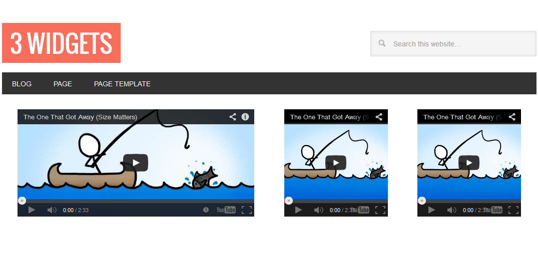
Here’s the result which displays 3 YouTube Videos:

widgets different widths inline

Update : You can now use CSS Grid to display any number and any type of widget inline. Here’s the CSS which assumes your PHP code which generates the widget includes the class, grid-container.

.grid-container .widget-wrap {
    display: grid;
    grid-template-columns: 2fr 1fr 1fr;
    grid-template-rows: auto;
    grid-gap: 1%;
    margin-top: 80px;
}

@media only screen and (max-width: 1023px) {

    .grid-container .widget-wrap {
        grid-template-columns: 1fr;
    }
    
}

There’s at least 2 ways you can do this:

  1. You can add the code in your child themes functions.php file which is the way i did it for her.
  2. You can code the front-page.php template if your theme includes one and if you want the widgets to only display on the front page.

Keep in mind the full width of the Metro Pro themes header is 1140px.

Using Your Functions File (1)

Here’s the code i added to the child themes functions & style sheet.

Using Your Front-Page Template File (2)

This solution involves adding the new functions directly to the front page template.

There’s some optional CSS code you can remove or modify to suit your own preferences.

Add Widgets Inline Of The Same Width

  • Add Featured Widgets Inline Anywhere In Genesis
  • Responsive Inline Header Widgets Side by Side in StudioPress Themes

Reader Interactions

Comments

  1. jodie scott says

    November 30, 2014 at 1:24 pm

    Thanks for the tutorial, worked great.

    Only problem is the logo image is now not responsive, did i miss something.

    Its quite a large image 500 x 169

    Log in to Reply
    • Brad Dalton says

      November 30, 2014 at 1:53 pm

      The CSS for the Media Queries would vary based on what you populate the widget with which could be any size so i would need to view your site to inspect the CSS while the widget is populated with your image.

      You can add the CSS to the existing Media Queries in your style sheet using the rules which include the classes for your widget or image.

      Log in to Reply
  2. AnitaC says

    October 1, 2013 at 3:29 am

    It works great!!! Thanks for doing this one!

    Log in to Reply
    • Brad Dalton says

      October 1, 2013 at 7:50 am

      Too easy with Genesis.

      Log in to Reply

Leave a Reply Cancel reply

You must be logged in to post a comment.

Primary Sidebar

Code written by Brad Dalton specialist for Genesis, WooCommerce & WordPress theme customization. Read More…

Advertise · WPEngine · Genesis · Log in

  • Access Problems
  • Account Details
  • Consulting
  • Tags
 

Loading Comments...
 

You must be logged in to post a comment.