
In this tutorial, we’ll look at how to add different images in the header of the Metro child theme by StudioPress.
By default, here’s what the header looks like with a title entered in the General Settings.

Looks o.k however there’s a margin for white space above and below which you may want to remove.
You may also want to add a full length header image or a logo and image in the header right widget which we’ll also cover in this post.
Here’s what we’ll do in this post:

Here’s the new demo logo, header right widget image and full length header image we’ll be adding in this tutorial.
Logo 300 width x 120 height
Header Right Widget Image 750 width x 120 height

Full Width Header Image 1080 width x 120 height

Getting the Logo Right First
All 3 images above are exactly the same height.
The default settings for this themes custom header can be found on line 64 of the themes functions.php file.
//* Add support for custom header
add_theme_support( 'custom-header', array(
	'width'           => 270,
	'height'          => 80,
	'header-selector' => '.site-title a',
	'header-text'     => false
) );
If you go to Appearance > Header and simply uploaded an image without matching the size to these settings, this is what it may look like.
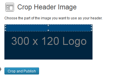
Because of the settings in the code above, our logo demo which is 300 x 120 will be cropped and not displayed properly on the front end.
To fix this, we firstly change the values in the PHP code above to match the exact same size of the logo.
//* Add support for custom header
add_theme_support( 'custom-header', array(
'width' => 300,
'height' => 120,
'header-selector' => '.site-title a',
'header-text' => false
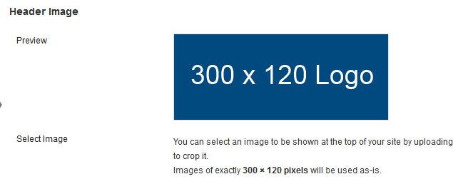
) );And then re-upload our logo image in the backend of WordPress:
Here’s what it now looks like in the front end:
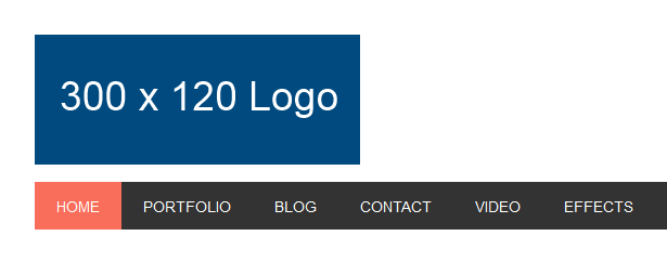
It looks better and the whole logo has been added without being forced to be cropped first, however its still not perfect.
To make it display fully, we’ll need to modify the values in the child themes style.css file.
On Line 867 we change the height from 87 to 120px
.site-header {
min-height: 120px;
overflow: hidden;
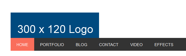
}That now makes the full logo image display however the margin & padding below the logo isn’t being displayed. You can keep it like that or change more CSS in your style sheet.
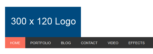
On Line 926, add some values to the margin and/or padding to add whitespace between your logo and the nav menu:
.header-image .site-title {
margin: 20;
padding: 0;
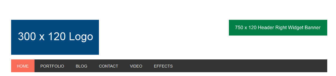
}And here’s what it looks like now:
Next step is to fill up that white space on the right side of the header with an image.
Perfect Alignment For Header Right Widget Image
You can upload and insert a new image in a post draft and then copy and paste the HTML for the image into a text widget which you then drag into the header right widget area.
This is what it will look like:
Ahmmmm its shunk.
To fix this, simply go back into your style.css file and change some values for the header widget on Line 942.
.footer-widgets-1,
.footer-widgets-2,
.footer-widgets-3,
.sidebar,
.subnav-left,
.site-header .widget-area {
	width: 31.111111111%; /* 336px / 1080px */
}
If you change the above value from 31.1% to something else, it will also effect the other classes you can see which use this same value in the declaration.
The reason the code has been consolidated like this is for efficiency however, we will need to separate the header widget code or your site will be messed up. So please leave that code untouched.
The best way to do this is to take the CSS for the site-header . widget-area and paste it at the end of the file, then change the value from a percentage to a pixel value like this:
.site-header .widget-area {
	width: 750px; /* 750px / 1080px */
}
Still with me?
Here’s what your header images look like now:
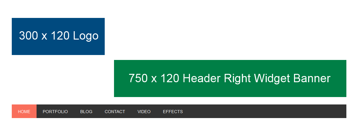
The width and height is right but the alignment needs one final adjustment.
Go to Line 881 and copy this code below which needs to be pasted at the end of your file and modified:
.title-area {
	width: 300px; /* 300px / 1080px */
}
Looking good now:

You’ve done well and must have a smile on your face now?
But wait! There’s more that can be done.
Lets remove some of that white space above the header images as you already know how to remove whats below them.
On line 401, copy the CSS code for the site-container and paste it at the end of your file removing the 2.25rem value for the padding.
.site-container {
    clear: both;
    padding: 0;
}
Here’s the result which is pretty much perfect except for the color matching which you may find help for using these color tools.

Full Width Header
Simply change the values in your functions file to match the full width header with and height. Then you simply upload your header banner which is exactly the same size.
add_theme_support( 'custom-header', array(
	'flex-height'	=> true,
	'height'		=> 120,
	'width'			=> 1080
) );
Here’s how easy it is:

This way you can still use the header right widget for a search box, social follow buttons and some text.
You may need to modify the CSS code for the search box width in your style sheet.
Here’s more about how to change different logo & header image sizes in themes using the Genesis framework.
Leave a Reply
You must be logged in to post a comment.