
In this tutorial, i’ll show you one way to remove all the padding and margins for the Lifestyle Pro themes header.
Update: Here’s a better solution tested on the latest version of Lifestyle Pro Responsive Full Header Image
This post is an extension of a previous post about how to Customize Lifestyle Pro Theme Header Image Area.
We”ll cover both the:
- Default header image size
- Using the full width header
Default Header Image Size
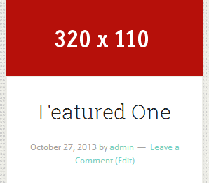
This solution assumes you’re using the default header image size of 320 × 110 pixels.
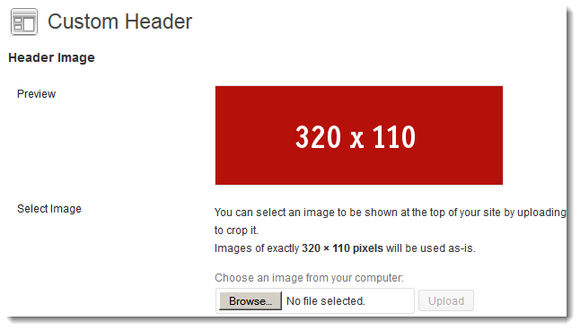
And here’s the front end:

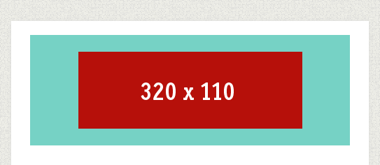
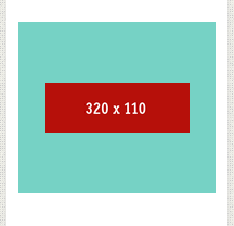
This is what it will look like on smaller screens.
@543 px
@216 px
Change Background Color
To change the background color, simply add this code at the end of your child themes style.css file.
.site-header {
    background-color: #fff;
}
Remove Padding & Margins On Smaller Screens
Simply paste this CSS code after your Media Queries at the end of your child themes style.css file.
/*
Custom Media Queries
------------------------------------------------------------ */

@media only screen and (max-width: 1023px) {

.header-image .site-title a {
		background-position: center !important;
		margin: 0 0 16px;
		margin: 0 0 1.6rem;
	}

	.site-header {
		padding: 0px;
		padding: 0rem;
	}

	.site-header .widget-area {
		margin-top: 16px;
		margin-top: 1.6rem;
	}

	.site-header .search-form {
		margin: 16px auto ;
		margin: 1.6rem auto;
	}

}

@media only screen and (max-width: 767px) {

.header-image .site-title a {
	padding: 0;
	margin: 0;
	}

	.header-full-width.header-image .site-title a {
    background-position: 0;
    margin: 0;
    }

	.site-header {
    background-color: #fff;
    overflow: hidden;
    padding: 0;
    }

.site-container {
    background-color: #FFFFFF;
    box-shadow: 0 0 5px #DDDDDD;
    margin: 0 auto;
    max-width: 1140px;
    overflow: hidden;
    padding: 0;
    }

	.site-inner {
    clear: both;
    padding: 0;
    }

}
Remove CSS Code From Line 1896
Remove this code from Line 1896 of your child themes style.css file in this Media Queries section: @media only screen and (max-width: 767px) {
.header-image .site-title a {
		background-size: contain !important;
	}
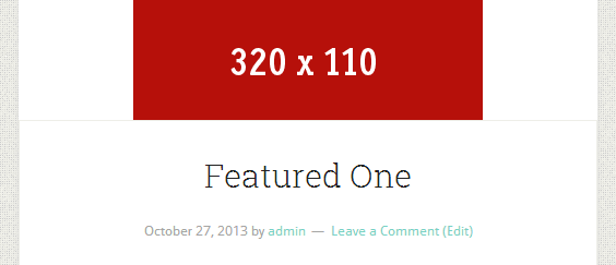
And here’s the result.
@564px
@298px
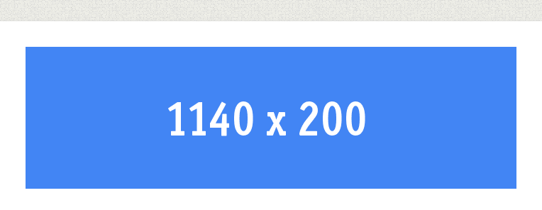
Full Width Header
Here’s an example of what a full width header looks like without removing any padding or margins:

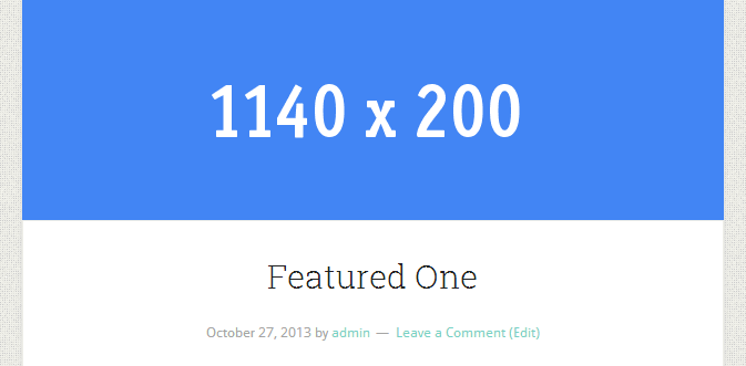
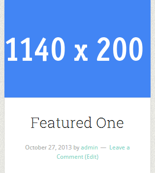
This is how the above code makes a full width header which is 1140px X 200px look on smaller screens:
@764px
@673px
@315px
I hope that gives you a better understanding of the different ways you can customize your header image to display differently when viewed on different sized mobile devices when using the Lifestyle Pro theme by StudioPress.
Different Images At Different Screen Widths
If you want to display different images on different mobile devices, here’s a tutorial which shows you how.
Leave a Reply
You must be logged in to post a comment.