
This tutorial provides the code which enables you to display different sized logo’s at different screen widths.
Update : New solution – Different Sized Header Images For Any Screen Width – Mobile Responsive
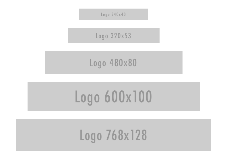
Here’s the demo which shows you exactly what the code below produces.
float: left; in the CSS so the logo always floats left however in the code below i have removed this declaration because this demo uses a full width header image. The CSS and image sizes will be different for smaller images and logos.Once you add the code in your child theme, you can then add any number of different sized images and choose the screen width you want them to display at.
The images included in this tutorial represent the maximum recommended width for a specific screen width assuming you don’t want to use any left or right padding or margin.
The result shows you how you can keep any text in your image centered without it being cutoff when the screen size reduces below the width of your image.
Tested on the Genesis Sample child theme by StudioPress themes.
Here’s the solution for members of WP Sites.
Leave a Reply
You must be logged in to post a comment.