• Skip to primary navigation
  • Skip to main content
  • Skip to primary sidebar

WP SITES

2784

Original Genesis Tutorials & 6000+ Guaranteed Code

Snippets

  • Consultation
  • Full Access
  • Log in

Make Native Gallery Columns Responsive Using CSS Media Queries

This tutorial enables you to change the amount of columns your gallery displays at different screen widths.

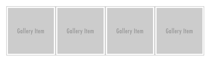
Here’s the demo gallery which displays 4 columns at screen widths above 800px.

4-columns

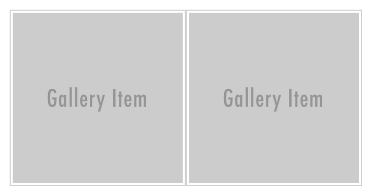
In this example we’ll reduce the columns to 2 on mobile devices when the screen width reduces below 800px.

2-columns

When the screen width hits 480px, we’ll also change the columns from 2 to 1 like this:

1-column

Here’s the CSS you can add to your existing Media Queries near the end of your child themes style.css file and modify according to your own needs:

Register for full access

Reader Interactions

Leave a Reply Cancel reply

You must be logged in to post a comment.

Primary Sidebar

Code written by Brad Dalton specialist for Genesis, WooCommerce & WordPress theme customization. Read More…

Advertise · WPEngine · Genesis · Log in

  • Access Problems
  • Account Details
  • Consulting
  • Tags
 

Loading Comments...
 

You must be logged in to post a comment.