
This page template enables you to display an unlimited number of widgets in any order in any StudioPress child theme.
The template includes widgets which extend the full width of the site container as well as 50%.
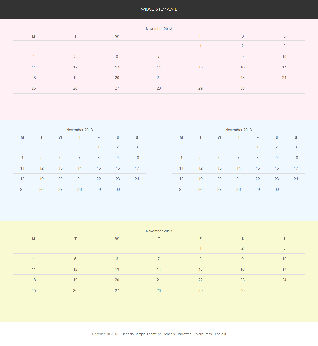
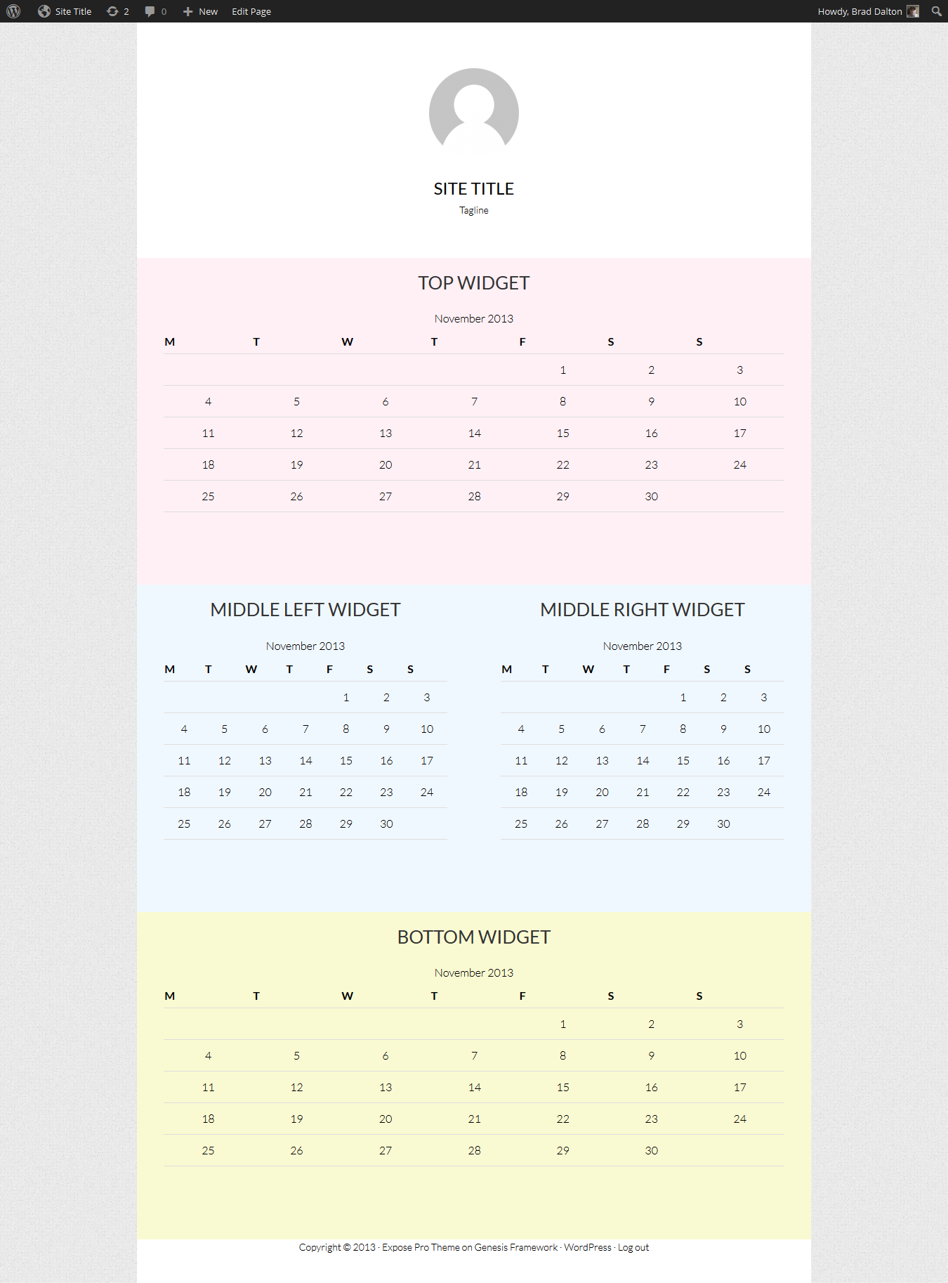
Here’s a very basic example:
There’s 3 simple steps you need to follow:
- Create a new file named page_widgets.php and add the PHP code below to the file.
- Add PHP code to register 3 widgets areas to your child themes functions.php file.
- Add optional CSS to your child themes style.css file which also includes a small amount of CSS for Mobile Responsiveness.
Here’s the PHP code for the first 2 steps:
And here’s the CSS.
.middle-widgets .widget {
float: left;
padding: 2% 4% 2% 4%;
width: 50%;
}
.widgets-template .site-container {
background: #fff;
}
.top-widget {
background-color: LavenderBlush;
}
.middle-widgets {
background-color: AliceBlue;
}
.bottom-widget {
background-color: LightGoldenRodYellow;
}
.widgets-template .site-inner {
clear: both;
padding-top: 0px;
padding-top: 0rem;
}
.widgets-template .site-inner, .wrap {
margin: 0;
max-width: 100%;
}
.top-widget,
.bottom-widget {
padding: 2% 4%;
}
@media only screen and (max-width: 767px) {
.middle-widgets .widget {
padding: 2% 4%;
width: 100%;
}
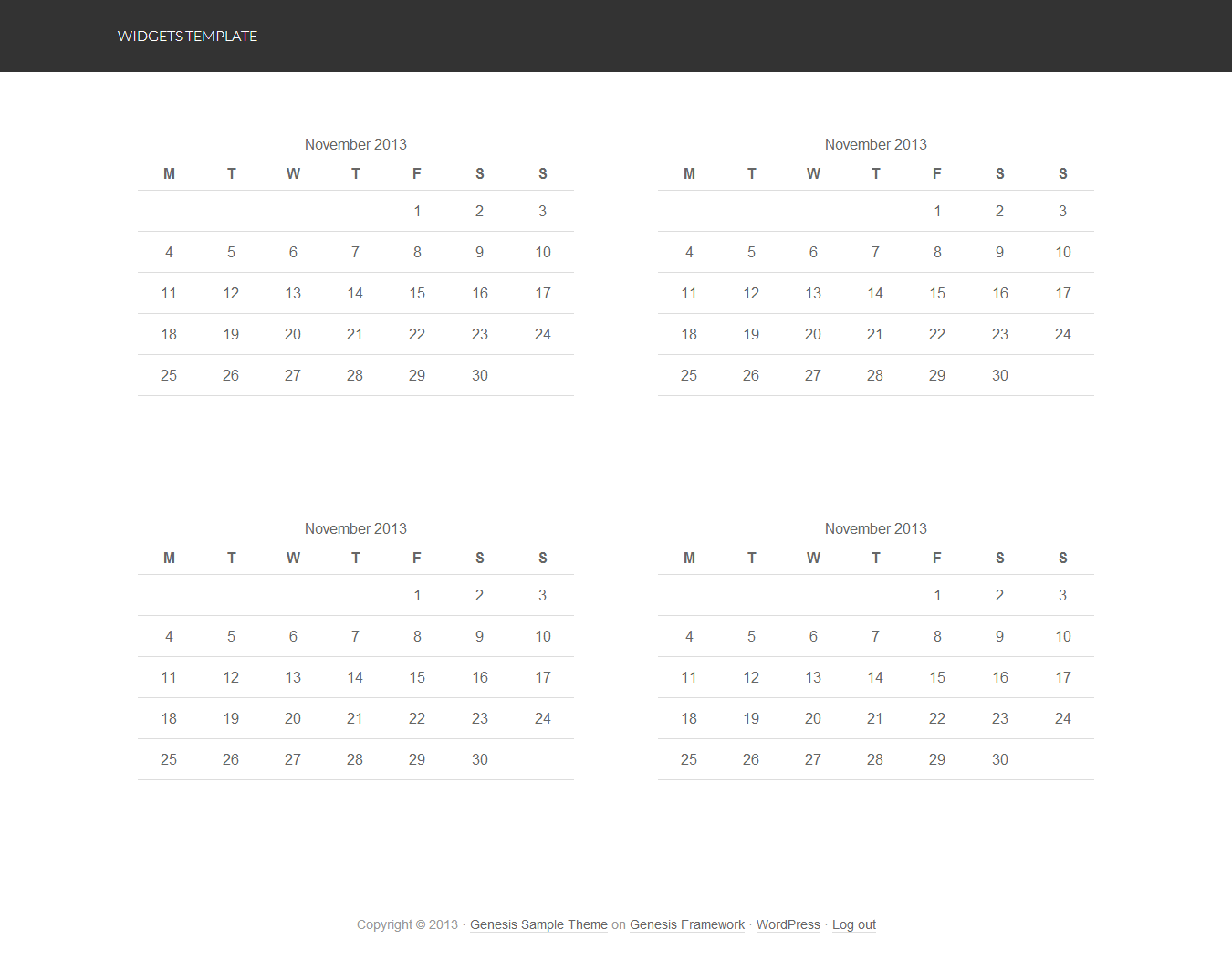
}Here’s what the template looks like if you don’t want to display your widget content full width of the site container:
In the above example, you only need to use this CSS:
.middle-widgets .widget {
	float: left;
	padding: 2% 4% 2% 4%;
	width: 50%;
}

.widgets-template .site-container {
background: #fff;
}

.top-widget,
.bottom-widget {
padding: 2% 4%;
}

@media only screen and (max-width: 767px) {

	.middle-widgets .widget {
	padding: 2% 4%;
	width: 100%;
   }

}
Change Display of Widgets
If you want to display 2, 4, 6 or more widgets in columns of 2 side by side, you can simply remove any widgets from the Top Widget area and they will display inline.
Here’s an example of what it looks like with 4 widgets in 2 columns:
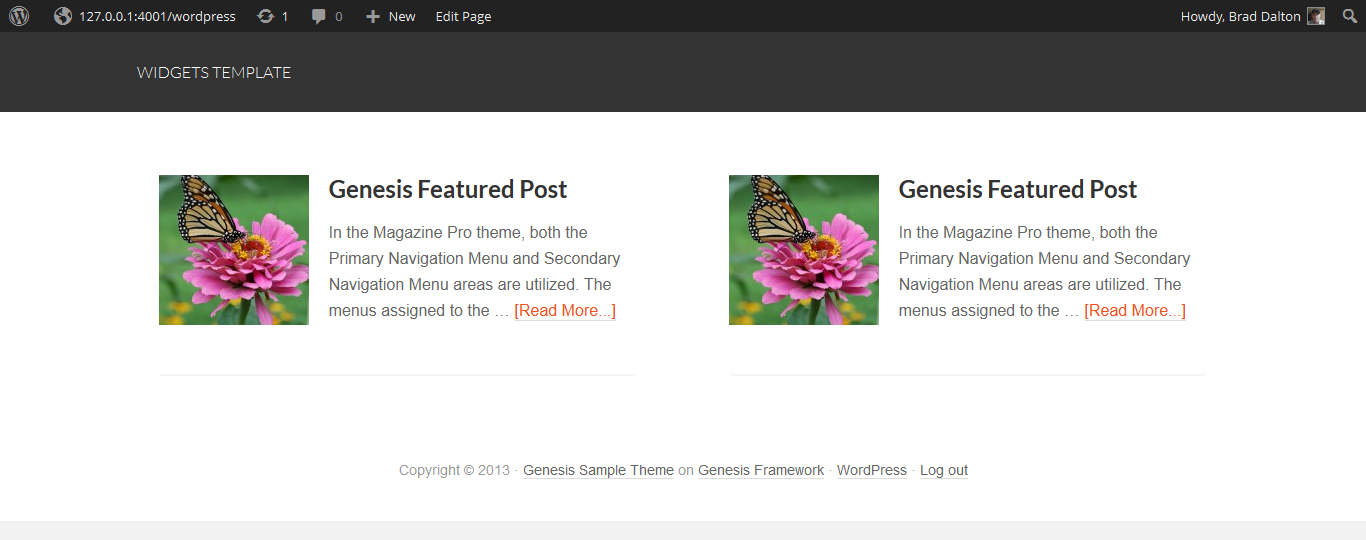
Using Genesis Featured Posts Widgets
Here’s what the middle widgets look like when using this CSS with the Genesis Featured Posts widgets.
.middle-widgets .widget {
	float: left;
	padding: 2% 4% 2% 4%;
	width: 50%;
}

.widgets-template .site-container {
background: #fff;
}

.top-widget,
.bottom-widget {
padding: 2% 4%;
}

.widgets-template .entry-image {
padding-right: 20px;
padding-bottom: 20px;
}
Display Multiple Author Profiles
You can also use this template to display multiple authors using the Genesis Profile widgets and linking them to specific pages of needed.
No Extra CSS code required:

And here’s an example when using the full width of the container:

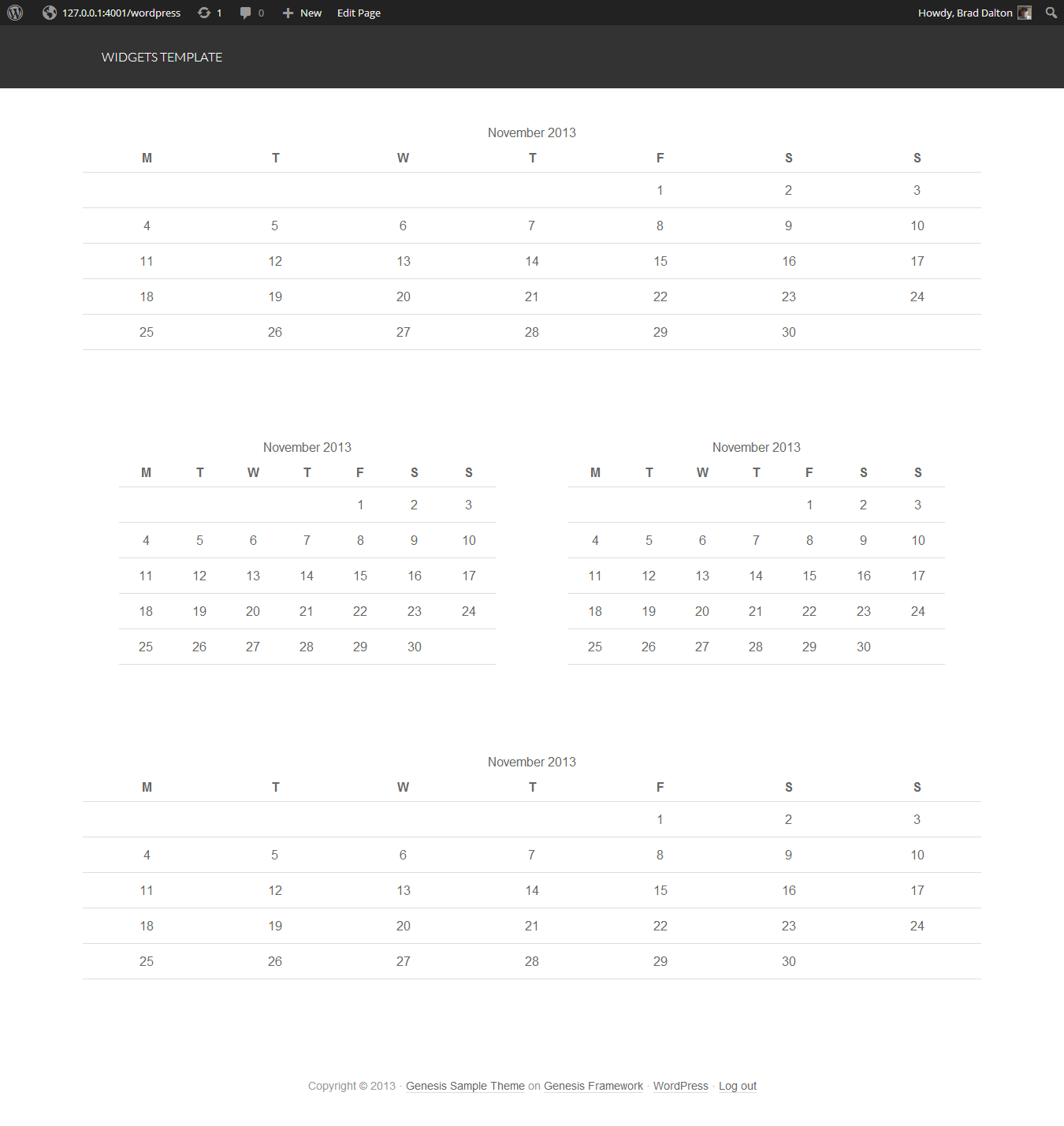
All code has been tested on the Genesis Sample child theme and the widget areas are responsive.
Style Each Widget Area Differently
You may find this post useful if you want to style each widget area differently
Leave a Reply
You must be logged in to post a comment.