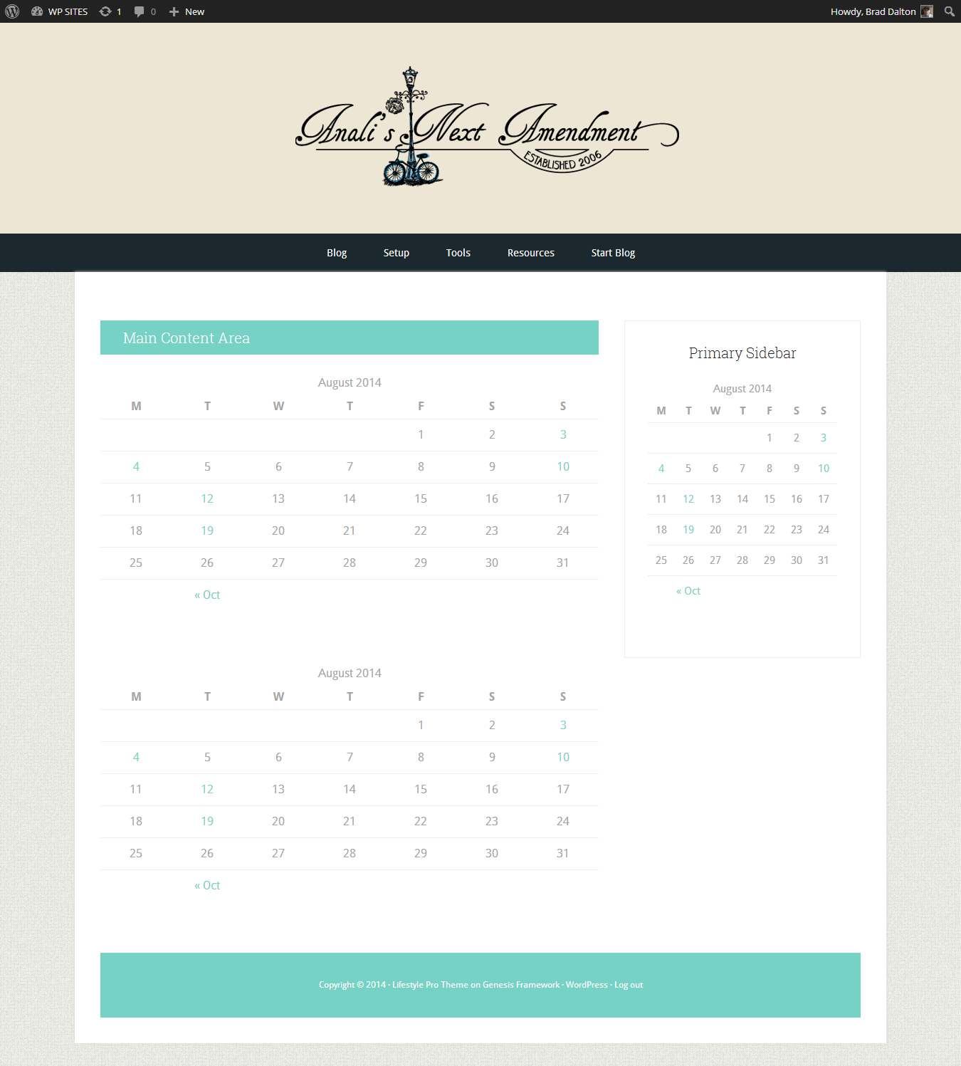
This tutorial enables you to display your header image so it spans the full width of the screen.
There’s 4 steps involved:
- Re-position the Genesis header and header markup before the header
- Modify the width and height values for the Custom Header function under the Appearance Menu
- Modify the width and height values for the Site Header elements in the CSS code in your child themes style.css file
- Remove the gap between the nav menu and site-inner jsut before the content sidebar wrap
1. Re-Position Header & Markup
This PHP code re-positions all the header elements so your header spans full width.
I’ve also included PHP code to reposition the nav menu after the header as well.
2. Modify Custom Header Dimensions
In your child themes functions.php file on Line 41 and 42, change the header height and width.
You can now upload a image exactly the same size as these values under the Appearance > Header screen.
3. Change Site Header CSS
In your child themes style.css file:
Line 830, change the value for the background color of your site-header:
.site-header {
	background-color: #EDE6D4;
	padding: 48px;
	padding: 4.8rem;
	overflow: hidden;
}
Line 894, change the value for the in-height to the height of your image which in this demo is 200px.
.header-image .site-title a {
	float: left;
	min-height: 200px;
	width: 100%;
}
Line 1062, change the background color of your primary nav menu.
.nav-primary {
    background-color: #1B282E;
}
4. Remove Gap Between Header & Content Area
Line 422 and 423, change the padding to remove the gap between the content area the nav menu.
.site-container {
	background-color: #fff;
	box-shadow: 0 0 5px #ddd;
	margin: 0px auto 32px;
	margin: 0rem auto 3.2rem;
	max-width: 1140px;
	overflow: hidden;
	padding: 36px;
	padding: 3.6rem;
}
Here’s the result for a clients site i worked on today:
Mobile Responsive?
Because we used the Custom Header function there’s no need to modify or add any responsive CSS as they’re already included in the themes Media Queries located at the end of the style sheet.


Leave a Reply
You must be logged in to post a comment.