
This code enables you to display 3 responsive widgets inline with a background image or background color, covering the full width of the widgets and the screen.
Here’s the demo showing the image added via the customizer, displaying behind all 3 widgets:
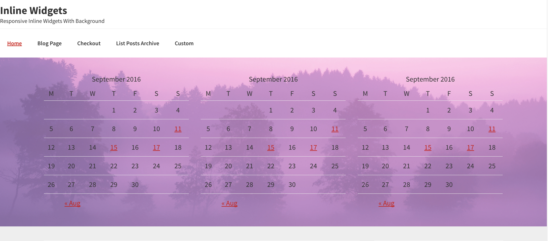
If no image is added, a background-color is added using CSS via your child themes style.css file:
.inline-widgets  {
    padding-top: 40px;
    background-color: pink!important;
}
You can simply remove or change the background image via the WordPress customizer.
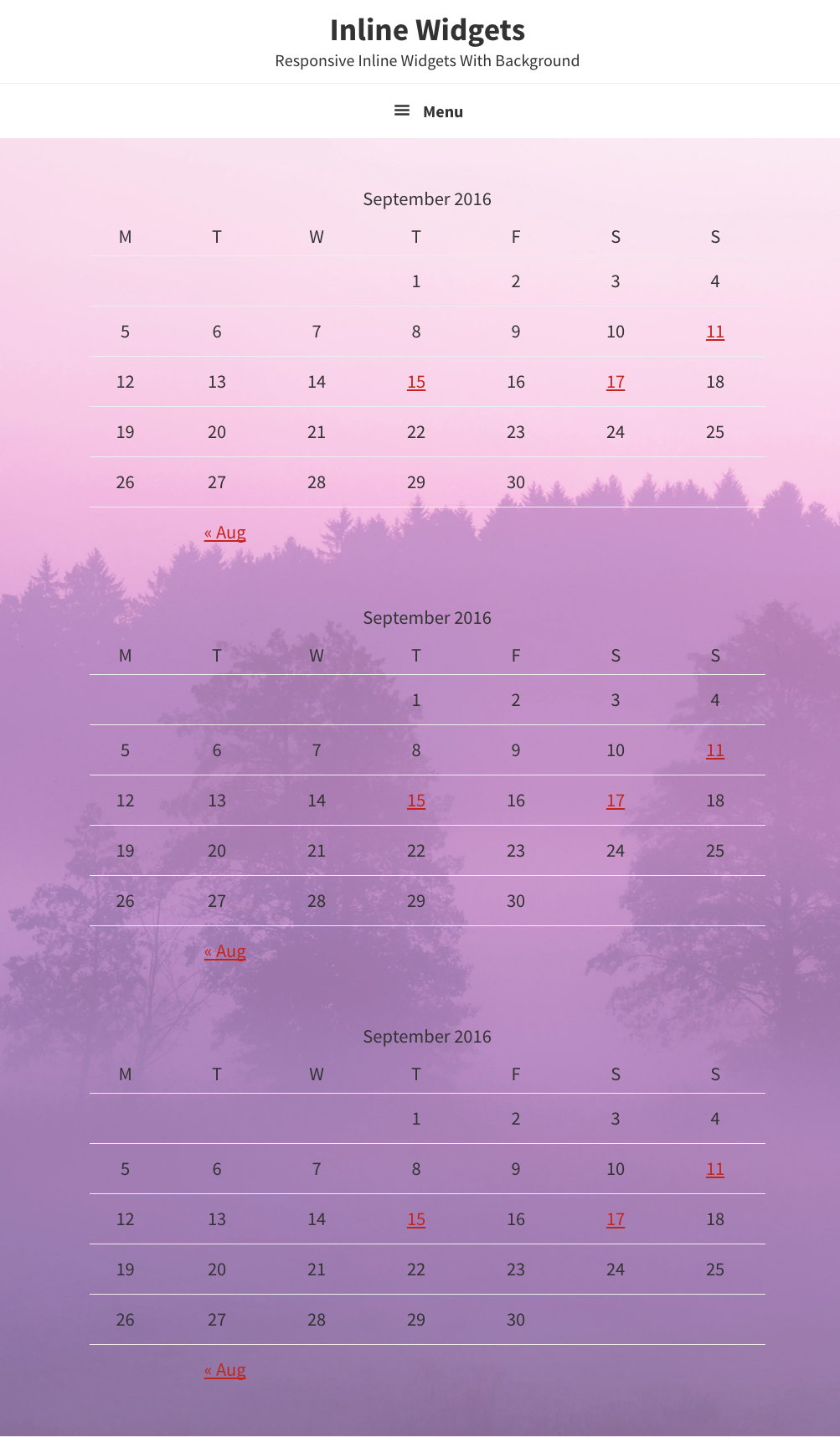
Mobile Responsive Demo
Code Installation
Firstly, Download Inline Widgets Files below.
Step 1 : Upload the bg-js folder to your child theme’s root directory.
Step 2 : Copy the PHP code from the functions.php file to the end of your child themes functions file.
Step 3 : Upload the front-page.php file to your child theme’s root directory.
Step 4 : Add a background image named inline-widgets.jpg to your child themes images folder.
Step 5 : Add the CSS from the style.css file to your child theme’s style.css file.
Note: If using a background image, you can remove the declaration for the background-color: pink!important; from the CSS in the style.css file included in the download folder. Also note, when adding additional structural wraps, you must merge the custom structural wrap with your existing wraps in your functions file.
Example:
/* Add support for structural wraps
add_theme_support( 'genesis-structural-wraps', array(
	'header',
	'nav',
	'subnav',
	'site-inner',
	'footer-widgets',
	'footer',
	'inline-widgets', //This has been added to existing structural wraps
) );
Here’s the code for logged in members:
Leave a Reply
You must be logged in to post a comment.