
You don’t need to be a coder to edit and use CSS.
You can style different elements of your site simply by using existing code.
If you’ve already added content boxes to your site, you can:
- Add more with rounded corners
- Change your existing boxes so the corners are rounded
I’ll show you how to do both quickly and easily.
You may find this post about how to create colored content boxes helpful if you haven’t created any yet. Otherwise, please use the last 2 blocks of code in this post to create your boxes with rounded corners.
Add Content Boxes With Rounded Corners
The secret to making your corners rounded is the blue code.
You can easily change any existing boxes by adding this blue code within the brackets.
/* Colored Content Boxes With Rounded Corners*/
.box-blue {
    margin:0 0 25px;
    overflow:hidden;
    padding:20px;
    background-color:#6BD5F1;
    border:1px solid #afcde3;
    -webkit-border-radius: 5px;
    border-radius: 5px;
}
You can replicate this code and create more code for each color. You can then change the hex code colors and use your own unique color.
The code in blue makes the corners rounded. You can change the values in pixels to your own liking.
Here’s 2 example’s.
Result Using 5 px Radius

Result Using 20px Radius

Simply add this code to your existing box code to create rounded corners.
-webkit-border-radius: 10px;
border-radius: 10px;
Displaying Boxes In Posts
Once you’ve added the code to your child theme’s style.css file, add this code to your HTML/text editor.
Each box will use a different selector.

Code for Boxes With Rounded Corners
Here’s the CSS code for the boxes with round corners.
/* Colored Content Boxes */

.box-blue,
.box-gray,
.box-green,
.box-grey,
.box-red,
.box-yellow {
	margin:0 0 25px;
	overflow:hidden;
	padding:20px;
	-webkit-border-radius: 10px;
        border-radius: 10px;
}

.box-blue {
	background-color:#d8ecf7;
	border:1px solid #afcde3;
}

.box-gray {
	background-color:#e2e2e2;
	border:1px solid #bdbdbd;
}

.box-green {
	background-color:#d9edc2;
	border:1px solid #b2ce96;
}

.box-grey {
	background-color:#F5F5F5;
	border:1px solid #DDDDDD;
}

.box-red {
	background-color:#f9dbdb;
	border:1px solid #e9b3b3;
}

.box-yellow {
	background-color:#fef5c4;
	border:1px solid #fadf98;
}
Copy and paste the above CSS code in you child themes style.css file. You also find the code to add to your text editor for each box color.
You can easily change the colors to your own by editing the hex code for background and border colors so they’re unique.
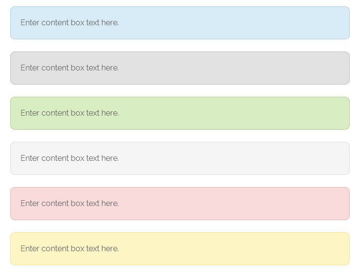
Here’s a screenshot taken using the CSS & HTML in the above 2 code blocks:
Make sure you clear caching after pasting the CSS.
Leave a Reply
You must be logged in to post a comment.