
The CSS examples in this tutorial enable you to display widgets added to 1 widget area in even or uneven responsive columns using CSS Grid.
Even Columns
The 1st example produces any number of even width columns.
This video shows what the code produces :
You can use the CSS with any existing widget area or create a new widget area css or new widget area.
genesis_register_sidebar( array(
'id' => 'css-grid-widget',
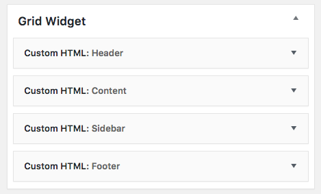
'name' => __( 'Grid Widget', 'genesis' ),
) );
add_action( 'genesis_after_header', 'front_page_grid_widget' );
function front_page_grid_widget() {
genesis_widget_area( 'css-grid-widget', array(
'before' => '<div class="grid-container">',
'after' => '</div>',
) );
}Then we can use CSS to display any number of widgets in even columns like this :
CSS Grid With Fallback #
Internet Explorer was phased out more than 3 years ago replaced by MS Edge however, if you want to include fallback CSS to support browsers which don’t support CSS Grid, use the following CSS rules as a guide.
.grid-container .widget {
        display: inline-block;
        width: 23.5%;
        margin: 0.5%;
}

@media only screen and (max-width: 960px) {

    .grid-container .widget {
        display: block;
        width: 100%;
    }

}

@supports (display: grid) {

    .grid-container {
        margin: 50px;
        display: -ms-grid;
        display: grid;
        -ms-grid-columns: 1fr 1fr 1fr 1fr;
        grid-template-columns: 1fr 1fr 1fr 1fr;
        grid-template-rows: auto;
        grid-gap: 20px;
    }

}

@supports (display: grid) {
@media only screen and (max-width: 1100px) {

   .grid-container {
        -ms-grid-columns: 1fr 1fr;
        grid-template-columns: 1fr 1fr;
    }

  }

}

@supports (display: grid) {
@media only screen and (max-width: 680px) {

    .grid-container {
        -ms-grid-columns: 1fr 1fr;
        grid-template-columns: 1fr;
    }

  }

}
You can set any number of columns simply by modifying these values :
grid-template-columns: 1fr 1fr 1fr 1fr;Or writing the CSS like this :
grid-template-columns: repeat(4, 1fr);Both declarations produce exactly the same result.
Uneven Columns
Note : MS Edge will be updated with grid on 17/10/2017.
This example shows you how to use CSS Grid to produce uneven columns. On top of this, it also shows you how to control the stacking order on smaller screens using Media Queries.
Here’s the video demo :
.grid-container {
    margin: 50px;
    display: grid;
    grid-template-columns: 1fr 1fr 1fr;
    grid-template-rows: auto;
    grid-gap: 20px;
    grid-template-areas:
        'header header header'
        'content content sidebar'
        'content content sidebar'
        'footer footer footer';
}

.grid-container .widget:nth-child(1) {
    grid-area: header;
    background-color: rgb(191, 191, 191);
}

.grid-container .widget:nth-child(2) {
    grid-area: content;
    background-color: white;
}

.grid-container .widget:nth-child(3) {
    grid-area: sidebar;
     background-color: rgb(169, 100, 234);
}

.grid-container .widget:nth-child(4) {
    grid-area: footer;
    background-color: rgb(172, 231, 64);
}

.grid-container .widget {
    padding: 30px;
}

.grid-container .widget {
    margin: 0;
}

@media only screen and (max-width: 1100px) {

   .grid-container {
        grid-template-columns: 1fr 1fr;
        grid-template-areas:
        'header content'
        'sidebar footer';
    }

}

@media only screen and (max-width: 680px) {

   .grid-container {
        grid-template-columns: 1fr;
        grid-template-areas:
        'header'
        'sidebar'
        'content'
        'footer';
    }

}
The CSS displays :
- The header widget full width
- The content widget 2/3 width
- The sideber widget 1/3 width
- The footer widget full width
The CSS for media queries @ 1200px displays :
- The header & content widgets 1/2 width
- The sidebar & footer widgets 1/2 width
The CSS for media queries @ 800px displays all widgets in 1 column and enables you to control the stacking order, in this case moving the sidebar widget before the content widget.
The widgets uses in this example are Custom HTML widgets with a widget name added however you can use any type of widget.
Leave a Reply
You must be logged in to post a comment.