
In this post, i’ll show you how to change the width and height of the header area so your image fits perfectly in that area.
We’ll be adding a full width header which is 1140px x 200px height.
Go to Appearance > Header and you’ll see its very easy to upload your image as long as its exactly the same size as the settings on that page.
Images of exactly 260 × 100 pixels will be used as-is
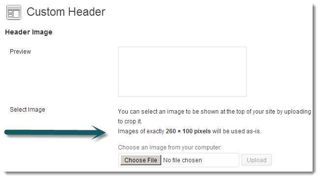
If its not, you will be forced to crop your image which is not what you want. So you need to change those settings.
Change Custom Header Width & Height
In your child themes functions.php file, find this code on Line 36 and change it to the exact same size as your header image:
//* Add support for custom header
add_theme_support( 'custom-header', array(
	'width'           => 1140,
	'height'          => 200,
	'header-selector' => '.site-title a',
	'header-text'     => false
) );
In this example we’ll use the full width which is 1140px and a height of 200px.
Save the changes you make to this code and now go back to Appearance > Header and upload your image.
Images of exactly 1140 × 200 pixels will be used as-is.
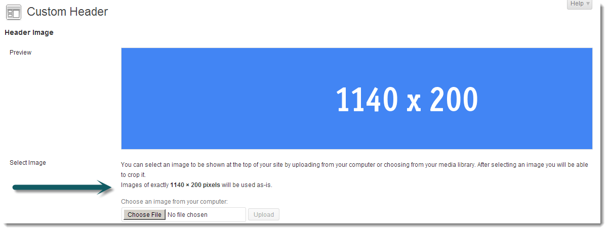
Now you can upload your full width image which matches the exact same size as the new values you have changed in your child thems functions file.
But Wait!
It still only displays the default size of 260 x 100.
Modify Header Image Title Area & Site Title Values
Simply add this code to the end of your child themes style.css file to change the width of the Header Image Title Area & Site Title.
/* Header Image Title Area & Site Title
--------------------------------------------- */
.header-image .title-area,
.header-image .site-title,
.header-image .site-title a {
	float: left;
	margin: 0;
	max-width: 1140px;
	min-height: 200px;
	padding: 0;
	width: 100%;
}
Its best to paste this code immediately before the start of your Media Queries near the end of the file.
Here’s the result which fits perfectly.

Mobile Responsiveness
Making the full width header image responsive on different sized devices is easy. Simply add the code below to each media query for the 5 default sizes already included in this themes style sheet.
.header-image .site-title a {
        background-size: contain !important;
}
Here’s the different sizes the above code needs to be added to.
- max-width: 1200px
		- max-width: 1023px
		- max-width: 767px
		- max-width: 500px
		- max-width: 270px
Example for 500px width screens:
@media only screen and (max-width: 500px) {

	.entry-title {
		font-size: 24px;
		font-size: 2.4rem;
	}

	.content .entry-header .entry-meta .entry-comments-link {
		display: none;
	}

	.header-image .site-title a {
        background-size: contain !important;
    }

}
I hope this tutorial gives you a better understanding of how to change the default header image sizes so your image fits perfectly.
Leave a Reply
You must be logged in to post a comment.